This is the user manual of Linkurious Enterprise.
The first two chapters titled Getting Started and Building Your First Graph Visualization will teach you the basics of using Linkurious Enterprise.
The following chapters are divided in themes. They go through the features of Linkurious Enterprise and explain how to apply them to successfully visualize graphs. It works both as a manual and a primer on graph visualization.
Just like our software, this guide assumes no prior knowledge of graph visualization techniques. If you read it thoroughly, you will be able to find valuable connections and structural patterns in your data, to improve your graph database, and to communicate your findings efficiently.
In this chapter, we will learn the basics of how to explore and visualize a graph database with Linkurious Enterprise.
This section of the manual and the following chapters are based on a dataset that emulates information used by investigators to fight fincrime.
The provided graph database has approximately 178 183 nodes and 3 203 993 edges. The graph contains 10 types of nodes:
Persons are linked to emails by the HAS_EMAIL edge.
Persons are linked to ip addresses by the HAS_IP_ADDRESS edge.
Persons are linked to loans by the HAS_LOAN edge.
Persons are linked to companies by the IS_OFFICER_OF edge.
Persons and companies are linked to phones by the HAS_PHONE_NUMBER edge.
Persons and companies are linked to addresses by the HAS_ADDRESS edge.
Persons and companies are linked to bank accounts by the HAS_BANK_ACCOUNT edge.
Companies are linked to each other bythe IS_SHAREHOLDER_OF edge.
Loans are linked to persons by the HAS_GUARANTOR edge.
Loans are linked to companies by the HAS_BROKER edge and the HAS_REALTOR edge.
Bank accounts are linked to each other by the HAS_TRANSFERED edge.
In order to follow this manual, we suggest you to
download and install the dataset.
Extract the archive and put its content in the folder
[YOUR_NEO4J_FOLDER]/data/graph.db.
Here is a look at the interface of Linkurious Enterprise.
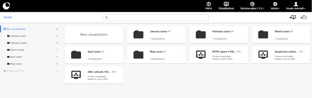
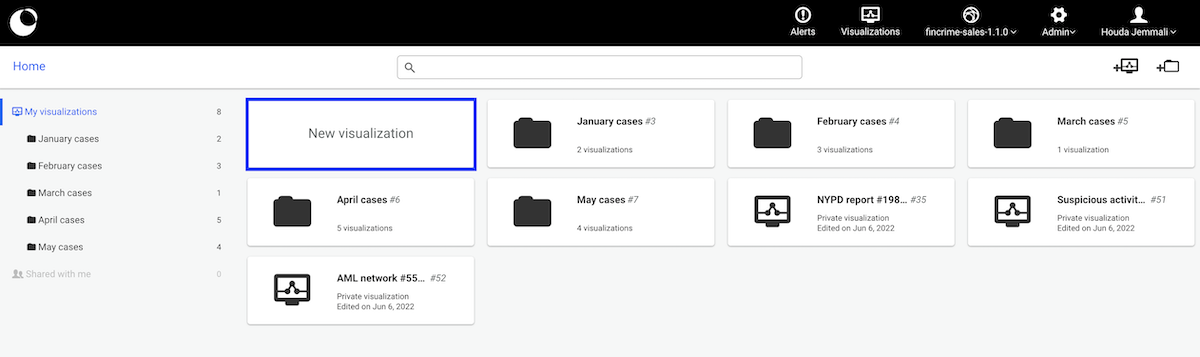
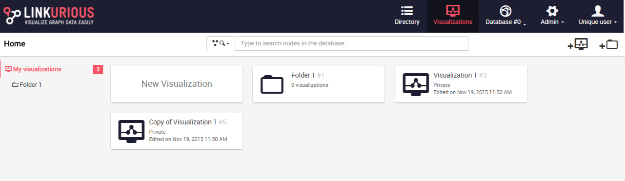
The dashboard lists the visualizations created by the user. The following image is of a typical dashboard in Linkurious Enterprise.
The workspace allows you to explore the graph database and represent it visualization as a node-link diagram.
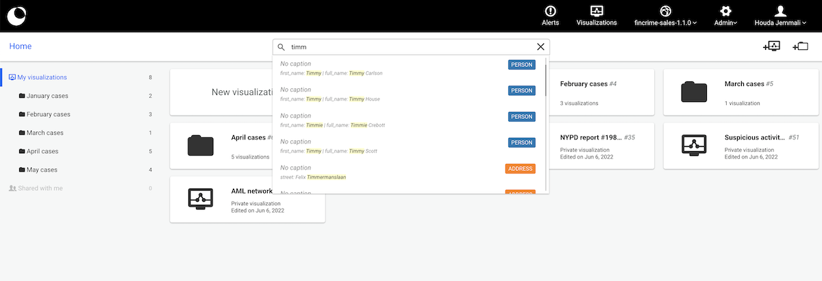
We can start to explore the data and get a quick overview of a node and its relations through the Quick Search bar. The Quick Search bar is accessible directly from the Dashboard. Here we will look for the Person Timmy Carlson.
Several matching results come up. We can select the one we are interested in and a visualization is created:
An alternative is to create a new visualization by clicking on New visualization in the Dashboard.
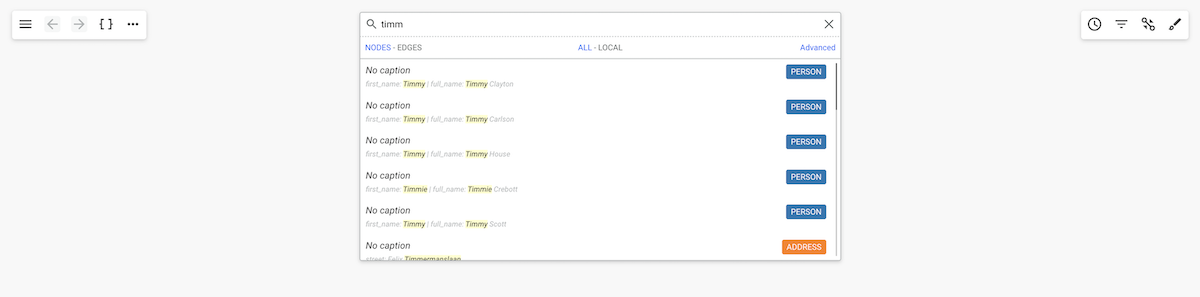
We can now search for nodes and edges.

For example, if we want to look for the Person Timmy Carlson, we simply
type the name of any property associated with this node.
Here, we type Timmy, which is the first name of the person.
Several results which contain the word Timmy in one of their
properties are returned. We can click on the one that we're interested in.
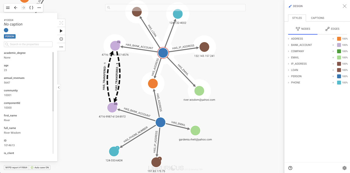
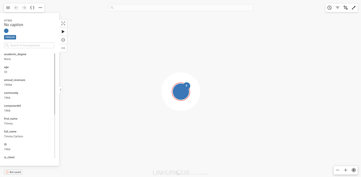
Here we selected the Person Timmy Carlson. The node appears in the graph area.
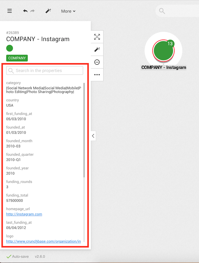
In order to view the different properties of a node, we click on it. Information immediately appears on the left side of the screen.
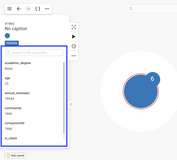
Here we can see that there is a node with the id #7466.
It has no caption and has a Person category.
Below we can see the various properties associated with the node.
For example the node has a first_name property with the value Timmy.
We can scroll down to see more properties or use the search bar to find a property.
Notice the number next to the node, it is the number of undisplayed edges.
Inspect edges in the same manner.
Time to find out about the particular edges of a node.
The easiest way to get that information is to double-click on the node
we are interested in. Here we are interested in Timmy Carlson.
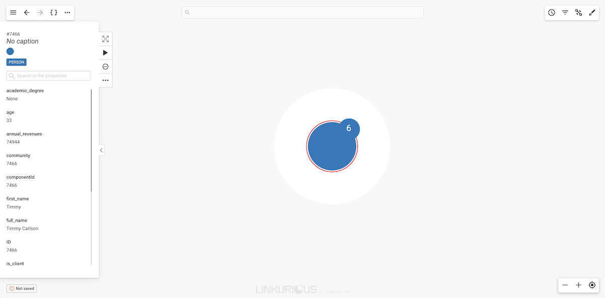
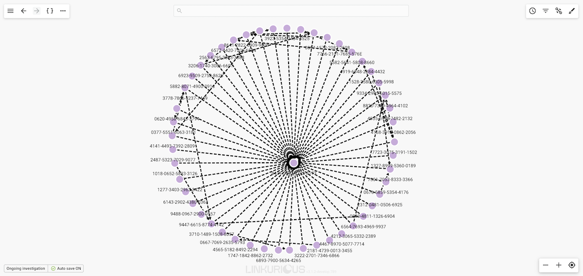
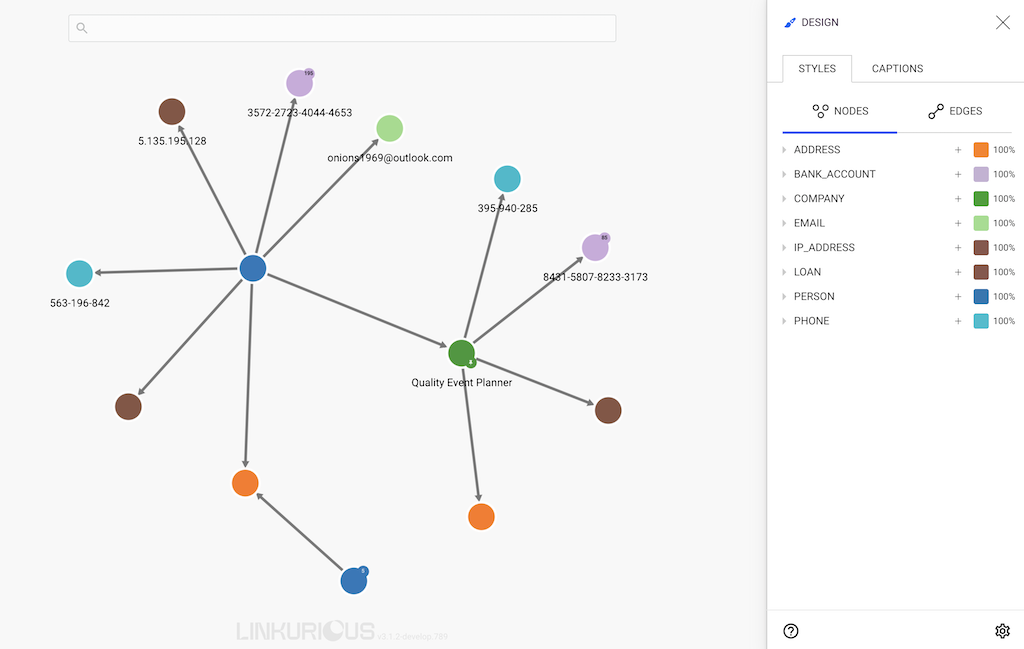
Now we can see some nodes that are connected to Timmy.
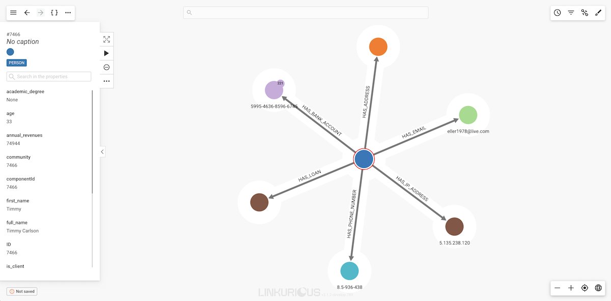
Notice the white halo around each node? All the nodes surrounded by the white halo are connected to the currently selected node (or nodes). In this case, all the nodes are connected to Timmy Carlson.
The lines between the nodes represent the edges. All the edges have a direction from one node to another (represented by an arrow).
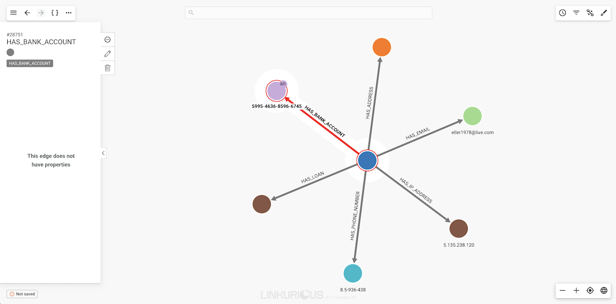
If we click on a given edge, the properties of that edge will be
displayed in the left panel.
In this chapter we cover the following topics:
Custom actions allow to open URLs that can be customized using data from the graph.
Custom actions allows a scenario such as:
Company node, the user right-clicks on a node and navigates to Custom actions in the context menu.Open in Salesforce.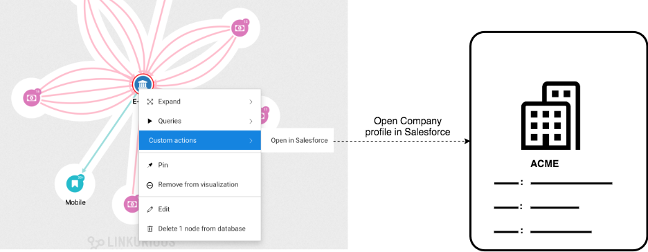
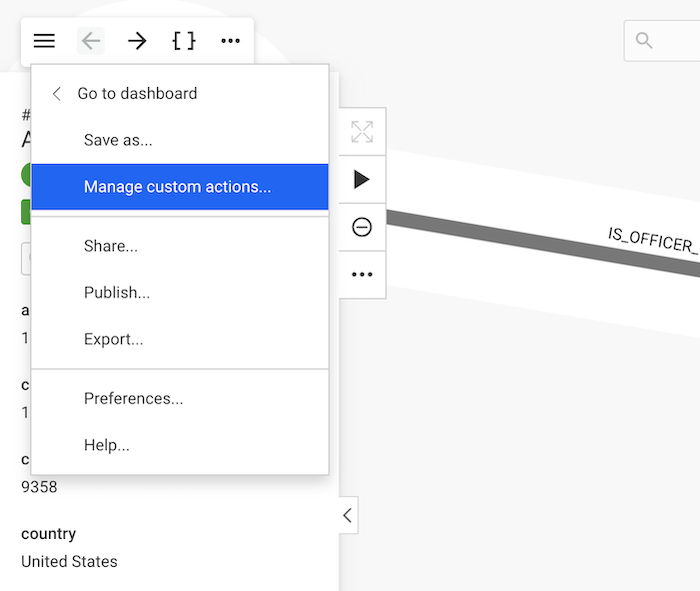
The panel can be accessed through the workspace, by opening the main menu and selecting "Manage custom actions ...".
The panel is available only to users who are authorized to create and manage Custom actions.
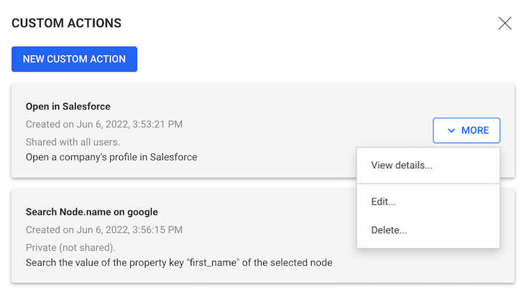
From the Custom actions panel, a user may:
In order to create a custom action a user:
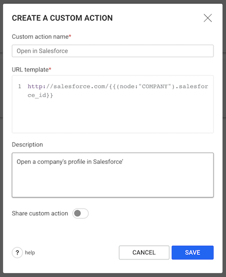
A Custom action contains a URL template with one of more variables that are replaced by actual values provided by the context.
Example:
https://google.com/?q={{node.first_name}}{{node.first_name}} variable will be replaced by the first_name property of the selected node.The following variables can be used in a URL template:
{{node}}){{node.first_name}}){{edge}}){{edge.amount}}){{visualization}}){{sourceKey}}){{baseURL}}){{nodeset}}){{edgeset}}){{nodeset.country}}){{edgeset.currency}})Several variables can be used in the same template
(e.g. https://google.com/search?q={{node.city}}+{{node.country}}),
with the constraint that "node" and "edge" variables cannot be mixed.
{{node}}By default, a custom action with a {{node}} variable will be
available on all nodes. To make this custom action available only
for Company nodes, use the following syntax: {{node:"Company"}}.
If multiple "Node ID" variables (or "Node property" variables) are used in a single custom action, they need to all have the same node-category constraint (see example 3).
Examples:
https://example.com/details?node={{node}}https://example.com/details?node={{node:"Person"}}https://example.com/node?id={{node:"Person"}}&name={{(node:"Person").name}}{{node.property_name}} or {{node."property name"}} (if the property name contains spaces of special characters).By default, a custom action with a {{node.property_name}} variable
will be available on all nodes. To make this custom action available
only for Account nodes, use the following syntax:
{{(node:"Account").property_name}}.
If multiple "Node property" variables (or "Node ID" variables) are used in a single custom action, they need to all have the same node-category constraint (see example 4).
Examples:
https://google.com/search?q={{node.firstName}}https://google.com/search?q={{node.firstName}}+{{node.lastName}}https://google.com/search?q={{(node:"Person")."First name"}}https://google.com/search?q={{(node:"Company").name}}+{{(node:"Company").city}}{{edge}}By default, a custom action with a {{edge}} variable will be
available on all edge. To make this custom action available only for
Transaction edge, use the following syntax: {{edge:"Transaction"}}.
If multiple "Edge ID" variables (or "Edge property" variables) are used in a single custom action, they need to all have the same edge-type constraint (see example 3).
Examples:
https://example.com/edge_details?id={{edge}}https://example.com/edge_details?id={{edge:"Transaction"}}https://example.com/edge?id={{edge:"Transaction"}}&amount={{(edge:"Transaction").amount}}{{edge.property_name}} or {{edge."property name"}} (if the property name contains spaces of special characters).By default, a custom action with a {{edge.property_name}} variable
will be available on all edge. To make this custom action available only
for Transaction edge, use the following syntax:
{{(edge:"Transaction").property_name}}.
If multiple "Edge property" variables (or "Edge ID" variables) are used in a single custom action, they need to all have the same edge-type constraint (see example 5).
Examples:
https://google.com/search?q={{edge.amount}}https://google.com/search?q={{edge.amount}}+{{edge.date}}https://google.com/search?q={{(edge:"Transaction")."credit card"}}https://google.com/search?q={{(edge:"Transaction").country}}+{{(edge:"Transaction").amount}}{{visualization}}Examples:
https://example.com/details?viz={{visualization}}https://example.com/details?viz={{visualization}}&node_id={{node}}{{sourceKey}}Examples:
https://example.com/details?source={{sourceKey}}https://example.com/{{sourceKey}}/{{node:"Company"}}{{baseURL}}/.Examples:
{{baseURL}}workspace/new?key={{sourceKey}}&populate=edgeId&item_id={{edge}}{{baseURL}}workspace/new?key={{sourceKey}}&populate=nodeId&item_id={{node}}{{baseURL}}plugins/my-plugin/show?key={{sourceKey}}&node={{node}}{{nodeset}}55,4,128,12By default, a custom action with a {{nodeset}} variable will be available on all nodes.
To make this custom action available only for Account nodes, use the following syntax: {{nodeset:"Account"}}.
Example:
http://example.com/nodes?ids={{nodeset}}{{baseURL}}plugins/my-plugin/show?nodes={{nodeset:"Company"}}{{edgeset}}55,4,128,12By default, a custom action with a {{edgeset}} variable will be available on all edges.
To make this custom action available only for HAS_ACCOUNT edge, use the following syntax: {{edgeset:"HAS_ACCOUNT"}}.
Example:
http://example.com/edges?ids={{edgeset}}{{baseURL}}plugins/my-plugin/show?edges={{edgeset:"HAS_ACCOUNT"}}{{nodeset.property_name}}france,germany,uk{{nodeset}} variables can be used in a template with different property and category constraintsBy default, a custom action with a {{nodeset.property_name}} variable will be available on all nodes.
To make this custom action available only for Account nodes, use the following syntax: {{(nodeset:Account).propety_name}}.
Example:
http://example.com/nodes?countries={{nodeset.country}}{{baseURL}}plugins/my-plugin/show?ssn_list={{(nodeset:"PERSON").ssn}}http://google.com/search?q={{(nodeset:PERSON).name}}+{{(nodeset:PHONE).number}}{{edgeset.property_name}}55,4,128,12{{edgeset}} variables can be used in a template with different property and type constraintsBy default, a custom action with an {{edgeset.property_name}} variable will be available on all edges.
To make this custom action available only for TRANSACTION edges, use the following syntax: {{(edgeset:TRANSACTION).propety_name}}.
Example:
http://example.com/edges?amounts={{edgeset.amount}}{{baseURL}}plugins/my-plugin/show_transactions?numbers={{(edgeset:"TRANSACTION").number}}http://google.com/search?q={{(edgeset:HAS_ACCOUNT).reference}}+{{(edgeset:TRANSACTION).device}}In this chapter, we will learn how to search nodes and edges with Linkurious Enterprise.
We will first look at how to search nodes and edges then we will be looking at different advanced search options Linkurious Enterprise provides.
We may have millions of nodes in our graph. What if we want to look at a specific node?
The first possibility is to use the Quick Search bar from the Dashboard.
The second possibility is to use the search bar in the Workspace once we have created a new visualization.

We can look for a node by typing the name of any of its properties.
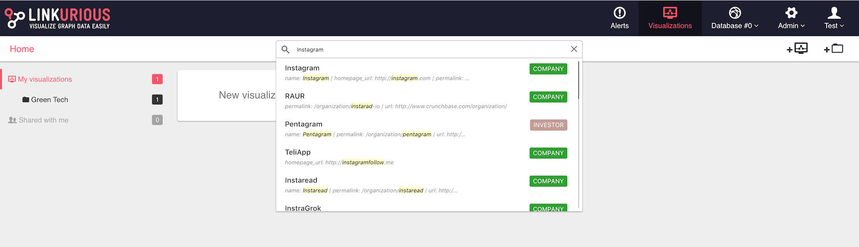
Here, for example, we look for the property Instagram.
We see the list of suggestions that match our search.

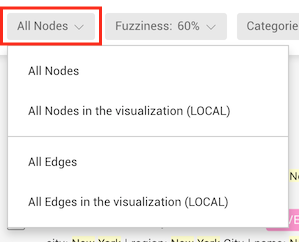
The search can be applied to all the nodes in the database or to all
the nodes in the visualization simply by switching from ALL to LOCAL
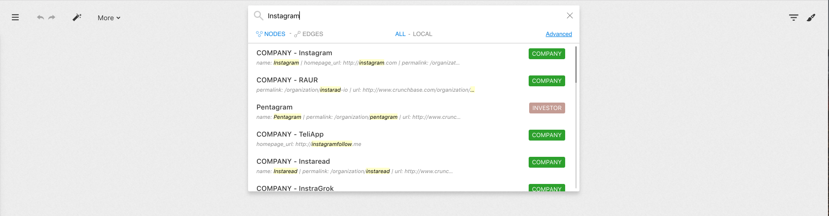
All the entries in the database containing the word Instagram will
appear. These results are sorted by relevance.
For each result we can see:
Instagram)Instagram contains the text Instagram
that matched our search)When we click on the result of our choice, it will be added to the workspace. Now we can visualize it.
How it works : by default, Linkurious Enterprise indexes all the properties of your graph. If any property of a node matches your search, it will be returned.
For example, you could find the
USAor2010-03.
The search bar in the Workspace provides an Advanced Search option not available through the Quick Search Bar of the Visualizations Dashboard. We can thus reduce the results to the category we are interested in. Those options are described in the Advanced search section.
We may have millions of edges in our graph. What if we want to look at a specific edge?
The fastest way is to use the search bar in the Linkurious Enterprise interface after we have have created a new visualization.
By default the finder will be set to find all nodes in the database.
To search an edge, we click on the Edges button after typing the search value.
To search only the edges present in the visualization, we click on the LOCAL button.
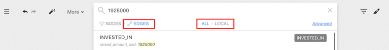
The search for edges works exactly like the search for nodes.
We simply type what we are looking for. We see the list of suggestions that match our search.
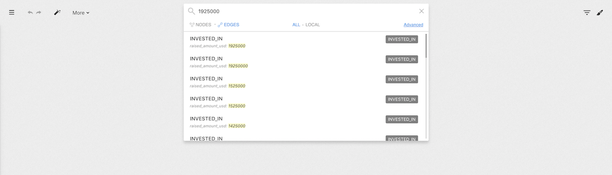
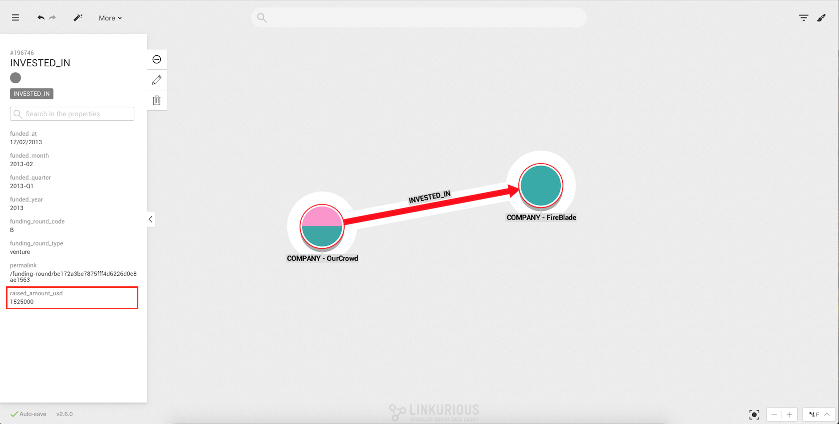
In the search result, we can see that there is an edge that has the value
1925000 for the property raised_amount_usd.
We choose the result we are interested in by clicking on it. It is immediately added to the workspace where we can visualize it.
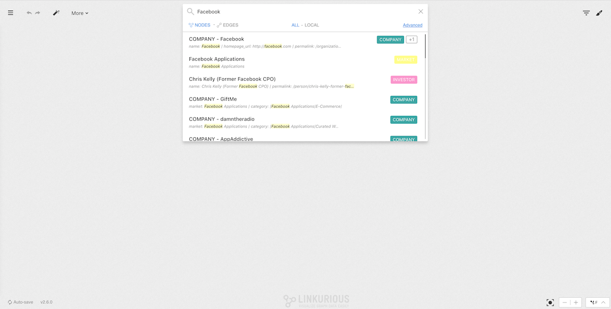
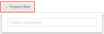
You're looking for a specific node or edge, and the search bar has returned too many results?
This usually means that your search query is not specific enough. You may want to narrow down your search by specifying a particular node-category or edge-type to search on, and by adding conditions on specific properties.
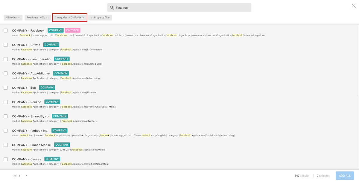
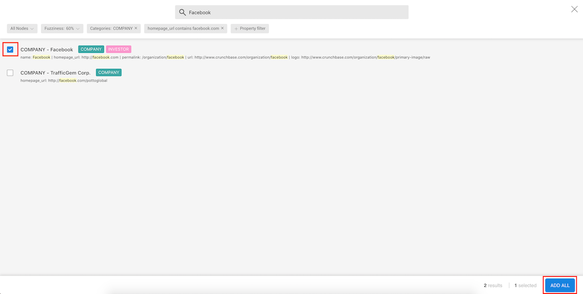
Searching for a company that contains the string facebook in any of
its properties returns a large number of results.
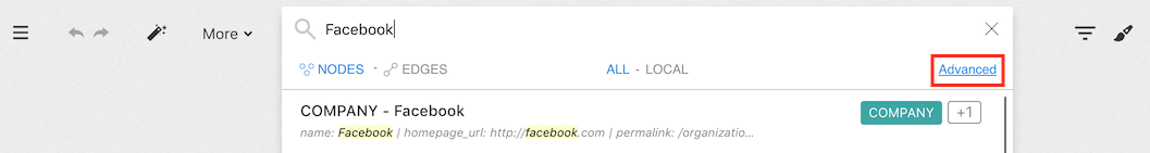
Let's try to narrow it down.
When we click on the Advanced link, a new menu appears:
In the footer of the advanced search screen, we see the number of nodes
whose properties contain facebook (353), and we're able to review them
by clicking through the result pages.
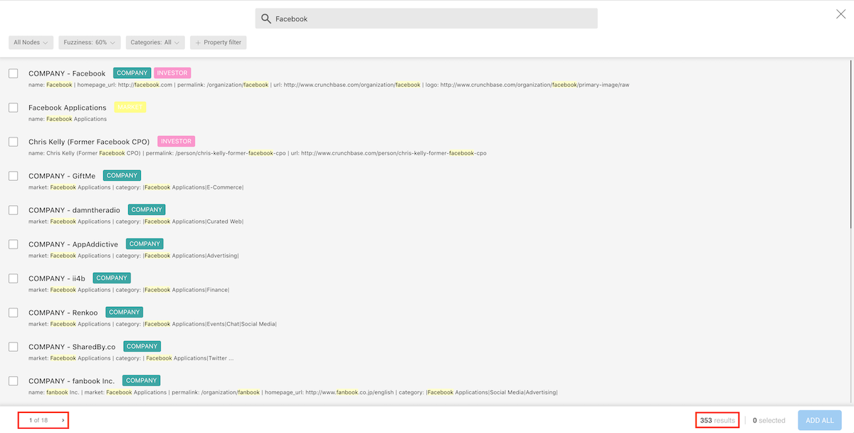
In the header, in addition to having the search text, we have the followings options:
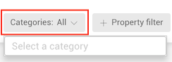
In our graph, facebook is categorized as a Company.
We are going to click and type Company on the category filter button
to restrict our search to the nodes that have the category Company.
We can now see the different results.
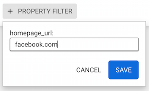
In our graph, a Company can have properties like category,
country, first_funding_at or founded_at and more.
Not all the nodes categorised as a Company will have all the
properties, though.
In order to narrow down our results, we are going to search multiple
properties at once.
To find Facebook, we are going to look for a company that uses
"facebook.com" as its homepage url.
Now when we type facebook, the results are filtered to show only the
nodes that have the category Company and the value facebook.com for
the property homepage_url.
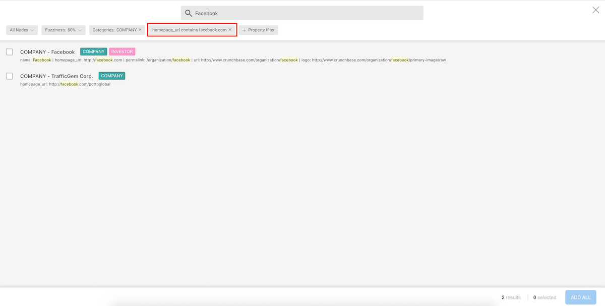
We can see that the results are now filtered.
We can now select the result we are interested in by clicking on the select box
on the left side of the result, then on the ADD ALL button.
The same approach can be applied to searching for edges.
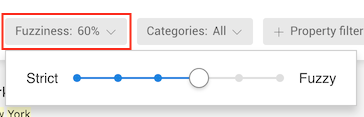
Linkurious Enterprise will look for exact matches for the values you enter in the search options menu.
Linkurious Enterprise offers a native user interface to do advanced search in the graph.
For advanced users, it is possible to directly use the search syntax in the search bar:
The search syntax accepts 3 expression types:
john"john" is searched against all indexed properties."john".john doe"john" and "doe" are searched against all indexed
properties, without consideration for order or distance between
the terms."john" and "doe"."john doe""john doe" is searched against all indexed
properties.type:type:Person: search on nodes of category "Person"type:"Big Customer": double-quotes are mandatory for a
category/type containing special characters, such as a space.$property-key: where $property-key is the name of the property.name:john"john" is searched against property name."john".name:(john doe)"john" and "doe" are searched against property
name, without consideration for order or distance between the
terms."john" and "doe".name:"john doe"name.paris type:City search for "City" nodes with any property containing
the term "paris"name:john doe search for all nodes for which there is:name containing "john"."doe"."serial number":"T3492E" search for all nodes with property
serial number matching exactly "T3492E".Numerical and date search only works with Elasticsearch on properties declared as "Number" or "Date" in the graph schema. To learn more please check how to configure numerical/date search.
Authorized operators:
><[x y]These operators must be followed by a number or an
ISO date string (i.e. yyyy-mm-dd).
Examples:
age:>20age:[10 to 100]age:[1.2 to 5,4]dateOfBirth:[1980-01-01 2000-12-31]In this chapter, we'll learn how to manipulate a graph, and more precisely the different options Linkurious Enterprise provides to explore and work on a visualization.
We will see how to select nodes and edges we are interested in and how to expand. Then we will learn how to hide them, how to apply a layout to the graph, how to pin nodes, how to undo/redo all actions and some useful shortcuts.
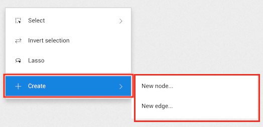
The easiest way to select a node or an edge is to simply click on it. It is also possible to select multiple nodes at once.
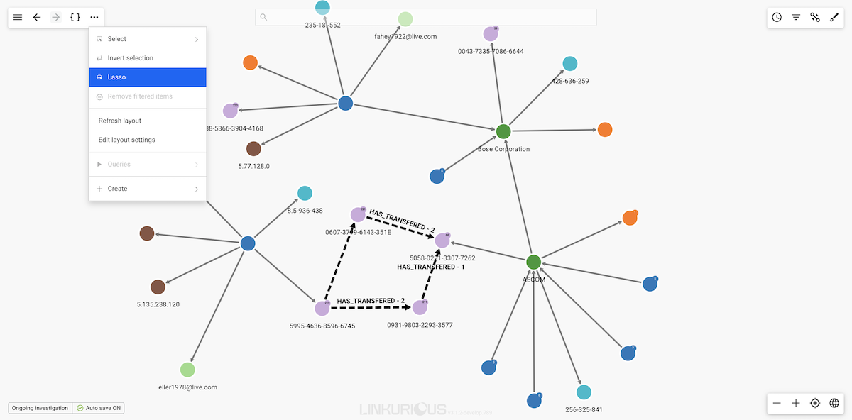
To do so, click on the ... in the top menu.
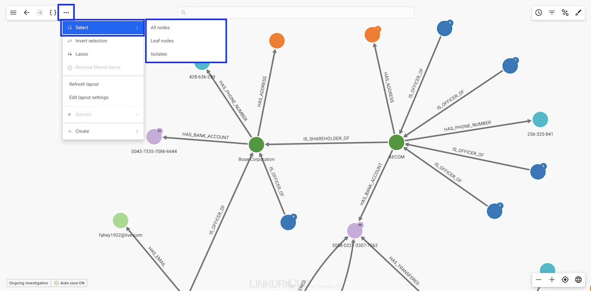
Or right-click on the background.
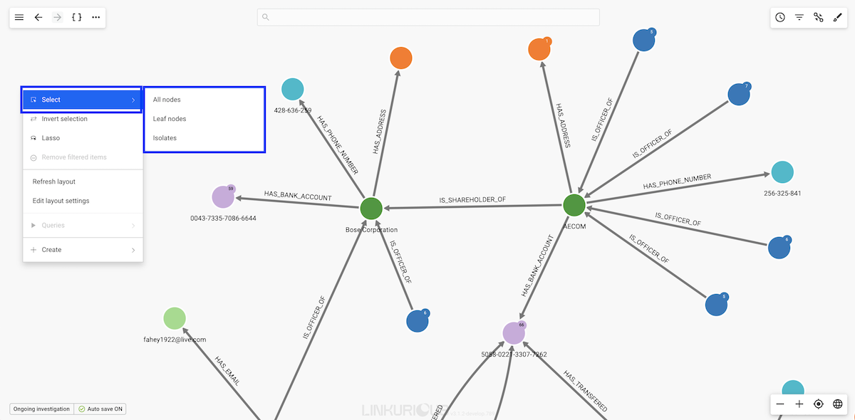
By selecting the sub-menu Select, you have the following options:
All nodes: select all the nodes in your current
visualization ;Leaf nodes: select the nodes in your visualization that have
only one edge ;Isolates: select the nodes in your visualization that have no
edges ;The following options are also available in addition to the sub-menu Select:
Inverse selection : invert your current selection ;Toggle lasso: select manually the nodes we are interested in ;Shortcuts are also available for this actions. See the list of Workspace shortcuts.
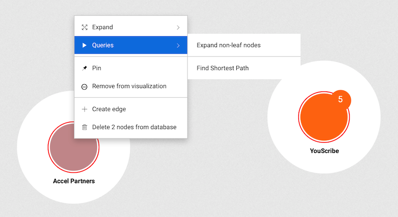
Expanding a node displays all the nodes connected to it.
Generally, you can do it in three different ways:
###Expand options The Expand button in the context menu and property panel shows the following options:
advanced.expandThreshold or advanced.supernodeThreshold, expand all connected nodes of the selected category. If not, the Selective Expand popin is opened.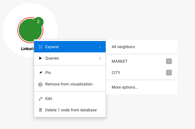
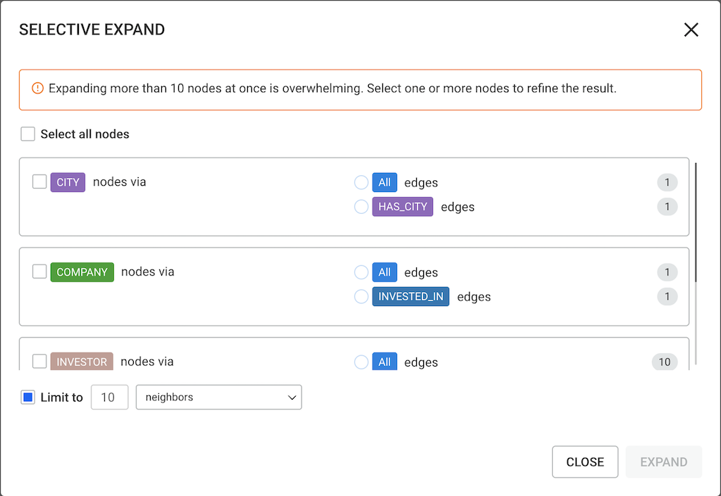
##Selective Expand The Selective Expand feature prevents adding too many neighbors at once. The popin provides options to:
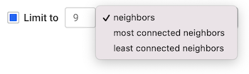
###Nodes that exceed the expand threshold
When expanding nodes that have more edges connected to it than advanced.expandThreshold but less than advanced.superNodeThreshold, you see the following Selective Expand popin:
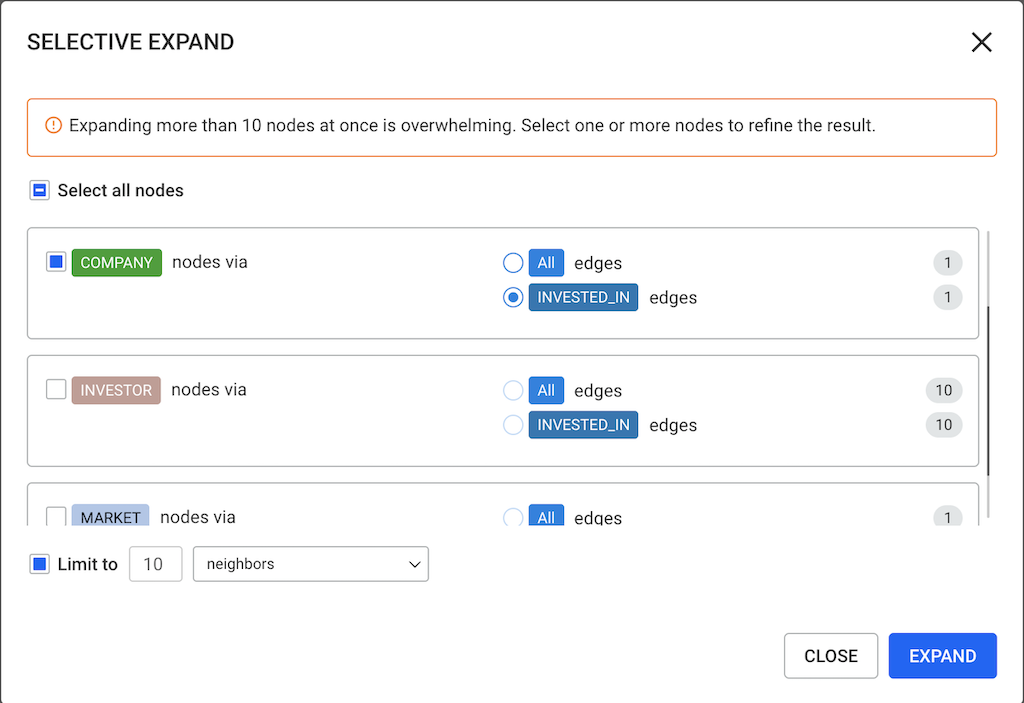
Selecting only one category allows you to expand nodes of that category and select a specific edge type it is connected to. In the example below, we select node CITY and edge type INVESTED_IN:
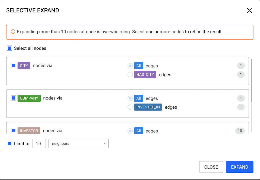
Selecting multiple categories allows you to expand nodes of those categories without the option of selecting the edge types. By default, all edges are selected.
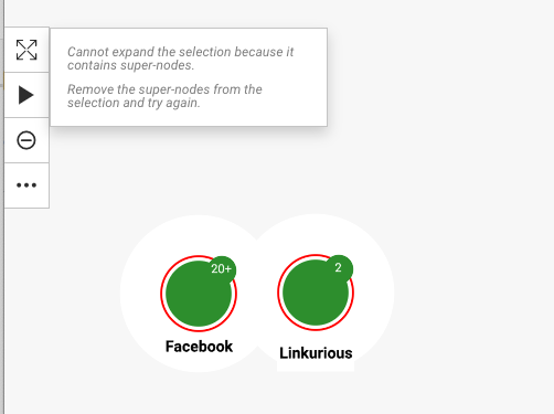
###Nodes that exceed the super node threshold In the visualization, a super node is marked with a plus badge along with the number of connections it has.
When expanding nodes that have more node neighbors than advanced.superNodeThreshold, you see the following Selective Expand popin. Here the popin has the full list of relationships and categories to expand:
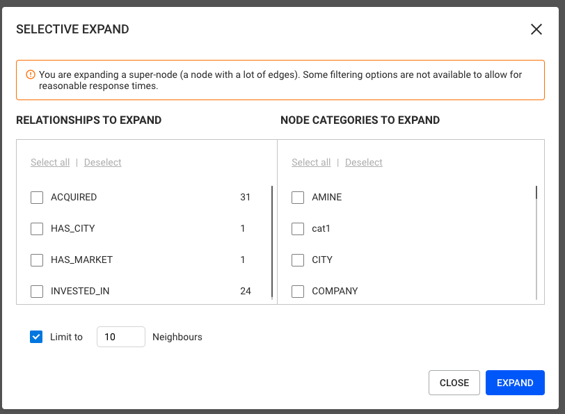
Note however that it is not possible to expand multiple nodes at the same time when at least one of the selected nodes is a super node.
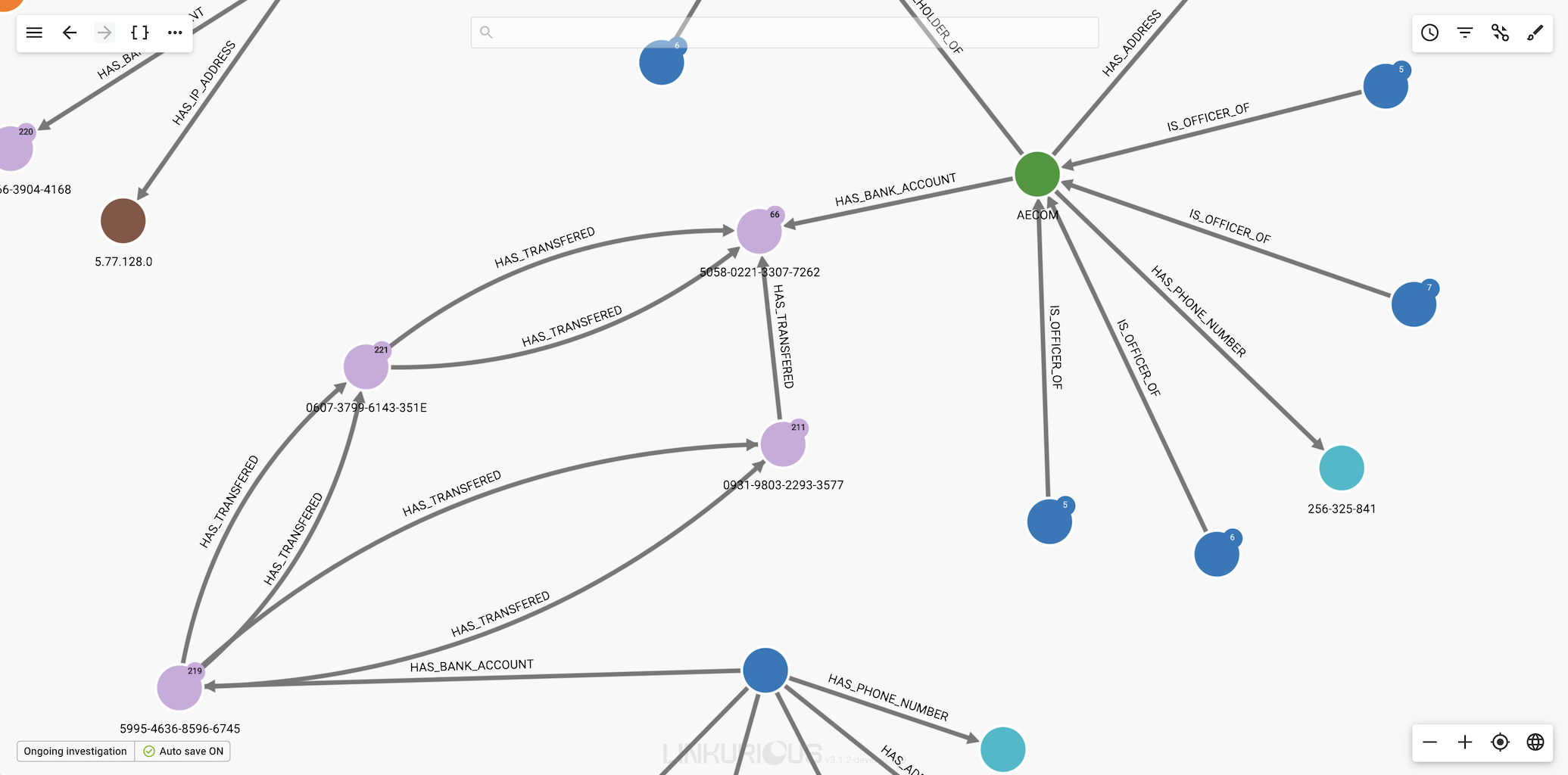
Edge grouping is a feature that allows users to group parallel edges sharing the same type to make visualisations more readable.
Example: Consider the following visualisation, we would like to group all the edges which has the type HAS_TRANSFERED.
The Edge grouping panel can be accessed by clicking on the following Icon on the right top of the screen.
![]()
The Edge grouping panel will open with the different edge types to group, in our example HAS_TRANSFERED, HAS_ADDRESS, etc.
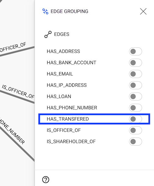
By clicking (enabling) the HAS_TRANSFERED button we will see that all the parallel edges with the same direction of that type are grouped in the visualisation as in the following figure.
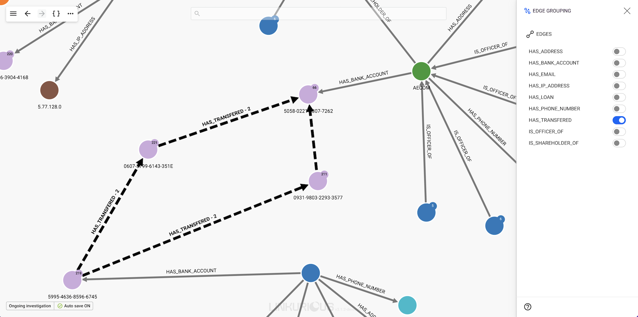
Please note that the number in the caption appearing next to the edge type indicates the number of edges within that group.
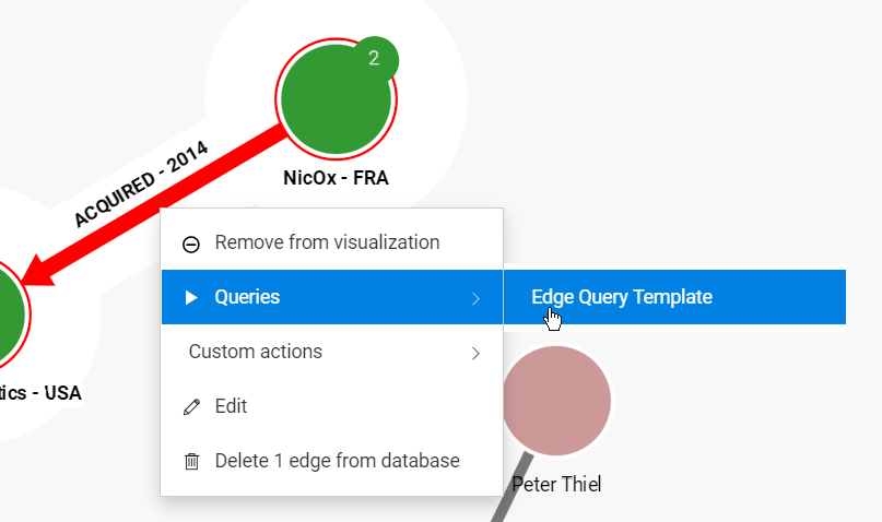
In this chapter, we will learn how to use queries and query templates:
Most graph databases support a query language that can be used to express pattern queries in the graph. For example, Neo4j supports Cypher and CosmosDB supports Gremlin.
The Cypher query language is similar to SQL, it can be learned from Neo4j's online documentation.
Standard queries can be executed from the Query Management panel, that can be opened using the Magic wand icon in the top left corner of the workspace.
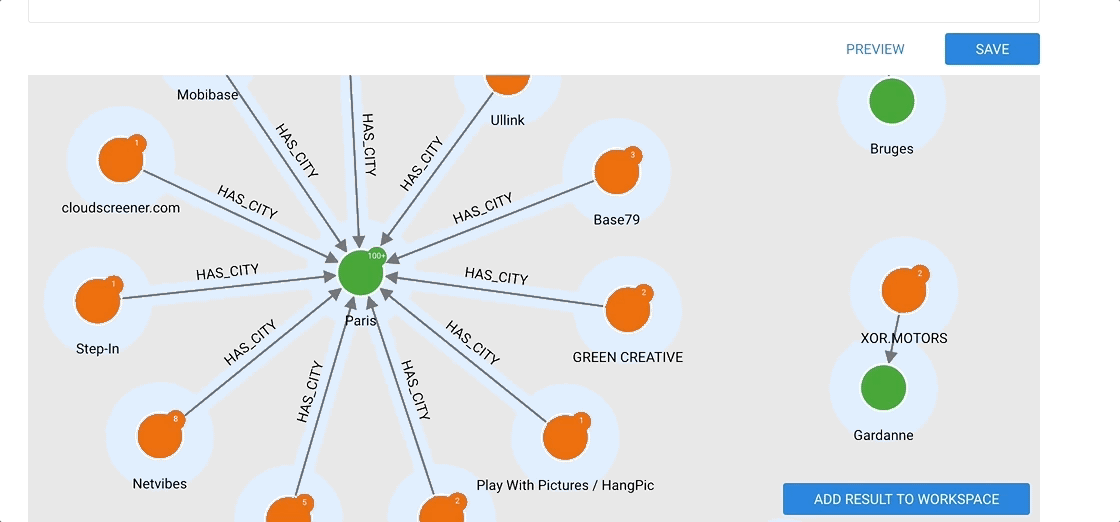
The following query returns all the cities that are connected to at least 3 companies and at most 100.
MATCH (city:City)<-[hasCity:HAS_CITY]-(company:Company)
WITH city, count(company) as score, collect(company) as companies, collect(hasCity) as hasCities
WHERE score > 3 AND score < 100
RETURN city, companies, hasCities
Note that the Cypher query has to contain a RETURN statement.
Only nodes and edges returned are displayed.
Returned values that are not a node or an edge (such as the score
in the previous example) are not displayed.
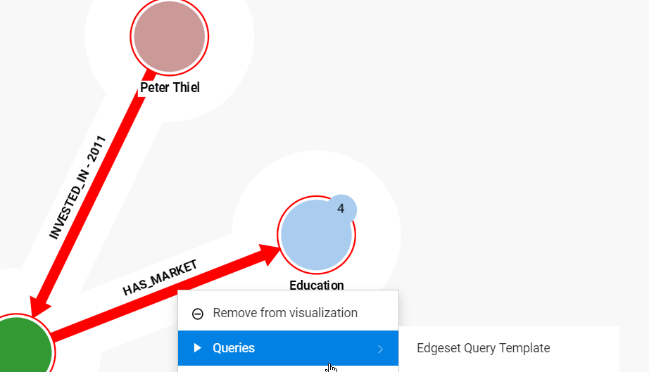
The following template returns, in the limit of "max", the "COMPANY" neighbours of the parameter node.
MATCH (n)-[edge]-(company:Company)
WHERE id(n) = {{"Node":node}}
RETURN edge, company
LIMIT {{"max":number:10}}
A query template accepts several types of variables:
Single-node query templates can be run on multiple nodes at once, the same way it is possible to expand multiple nodes at once.
The Query Management panel is opened through the "Magic Wand" icon in the workspace. It contains 3 tabs:
A user can view the details, execute and load in the editor:
A user can edit and delete:
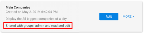
Queries and Templates can be shared:
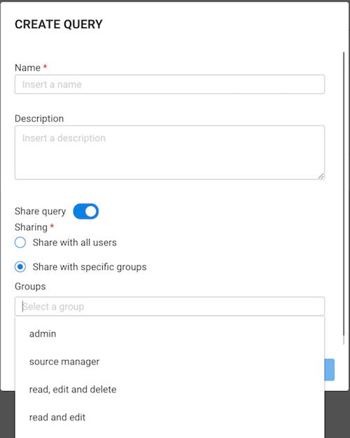
Queries and Templates can require a lot of computing resources from the database. Make sure to test your queries and templates properly and verify that you have enough computing power before sharing them. If overloaded, your database server may run slow or even crash, making the database unavailable, and Linkurious Enterprise unusable.
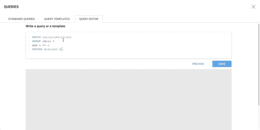
The Query Editor provides a place to create and validate queries before saving them.
The Preview allows to visualize the results of a query:
A Template is a mix of code (Cypher or Gremlin) and placeholders for variables. The way to declare the variables is inspired by the "Mustache" templating language, using the double curly braces to mark the start and end of a variable declaration.
Example:
MATCH (n)-[e]-(m) WHERE id(n) = {{"My node":node}} RETURN e, m
When a Template variable is detected, a form is generated and displayed to the right of the query editor, allowing the template to be tested.
A variable is made of 3 terms separated by a colon (:), the first 2 being mandatory:
node, nodeset, edge, edgeset, string, number, date, datetime, enum, env, list.A Query Template can be made of:
node or nodeset)edge or edgeset)number, string, etc.)When a Query Template consists of at least one node or edge variable, it is available through both the context menu and the Query Management panel.
When a Query Template consists of non-graph variables only, it is available through the Query Management panel only.
When a query template that consist of one node variable and any number of non-graph variables:
node variables in a Template.
nodesetE.g. the following Template returns only the nodes that are shared neighbours to each and every node of the input nodeset:
MATCH (n) WHERE id(n) in {{"My nodes":nodeset}}
MATCH (n)-[e]-(m)
WITH m, collect(e) as edges, count(distinct n) as sharedNeighborCount
WHERE sharedNeighborCount = length({{"My nodes":nodeset}})
RETURN m, edges
When a query template that consist of one edge variable and any number of non-graph variables:
edgesetE.g. the following Template returns only the edges that share a node with the input edgeset:
MATCH (n)-[e:INVESTED_IN]-() WHERE id(e) in {{"My edges":edgeset}}
match (n)-[e2:INVESTED_IN]-(m)
return e, e2, n, m
node variableUsed to inject a single node ID in a graph query.
node.categories (optional): string or array of strings restricting the availability
of the template to the specified categories (as a consequence, the
Template will show in the context menu only if the selected node has
one of the specified categories).Examples:
{{"my node":node:"COMPANY"}} (shorthand for category parameter){{"my node":node:["COMPANY","SUPPLIER"]}} (shorthand for category parameter){{"my node":node:{"categories": ["COMPANY","SUPPLIER"]}}}nodeset variableUsed to inject a list of node IDs in a graph query.
nodesetcategories (optional): Same as for node type.Examples:
{{"my nodes":nodeset:"COMPANY"}} (shorthand for category parameter){{"my nodes":nodeset:["COMPANY","SUPPLIER"]}} (shorthand for category parameter){{"my nodes":nodeset:{"categories": ["COMPANY","SUPPLIER"]}}}edge variableUsed to inject a single edge ID in a graph query.
edge.types (optional): string restricting the availability
of the template to the specified categories (as a consequence, the
Template will show in the context menu only if the selected edge has
the specified type).Examples:
{{"My edge":edge:["INVESTED_IN"]}} (shorthand for type parameter){{"My edge":edge:{"types": ["INVESTED_IN"]}}}edgeset variableUsed to inject a list of edge IDs in a graph query.
edgesettypes (optional): Same as for edge type.Examples:
{{"My edges":edgeset:["INVESTED_IN"]}} (shorthand for type parameter){{"My edges":edgeset:{"types": ["INVESTED_IN"]}}}enum variableUsed to inject a string, numerical or boolean value in a graph query, from a list of choices.
enumvalues (required): An array of values to choose from or an array of value + label.default (optional): A default value, must be one of the valuesExamples:
{{"my enum":enum:["FR", "EN", "US"]}} (shorthand for values){{"my enum":enum:[1, 2, 3]}} (shorthand for values){{"my enum":enum:[true, false]}} (shorthand for values){{"my enum":enum:{"values": ["FR", "EN", "US"], "default": "EN"}}}{{"my enum":enum:{"values": [{"label": "France", "value": "FR"}, {"label": "U.S.A", "value": "US"}]}}}boolean variableUsed to inject a true/false value in a graph query.
booleandefault (optional): A default valueExamples:
{{"my choice":boolean}}{{"my choice":boolean:true}} (shorthand for default value){{"my choice":boolean:{"default": true}}}date variableUsed to inject a date-time in a graph query.
dateformat (required): The serialization format of the date in the query, must be one of:native: serialized as a native Date database objecttimestamp: serialized as a numerical Unix timestamp in secondstimestamps-ms: serialized as a numerical Unix timestamp in millisecondsiso: serialized as a "yyyy-mm-dd" string (same as yyyy-mm-dd)yyyy-mm-dd: serialized as a "yyyy-mm-dd" string (same as iso)dd/mm/yyyy: serialized as a "dd/mm/yyyy" stringmm/dd/yyyy: serialized as a "mm/dd/yyyy" stringdefault (optional): A default value (expressed in "yyyy-mm-dd" format)min (optional): The minimum accepted value (expressed in "yyyy-mm-dd" format)max (optional): The maximum accepted value (expressed in "yyyy-mm-dd" format)Example:
{{"my date":date:"yyyy-mm-dd"}} (shorthand for format){{"my date":date:{"format": "yyyy-mm-dd"}}}{{"my date":date:{"format: "timestamp-ms", "min": "2018-01-02"}}}{{"my date":date:{"format": "yyyy-mm-dd", "default": "2018-01-01"}}}{{"my date":date:{"format": "native", "min": "1990-12-31", "max": "2018-12-31"}}}datetime variableUsed to inject a date-time in a graph query.
datetimeformat (required): The serialization format of the date-time in the query, must be one of:native: serialized as a native DateTime database objecttimestamp: serialized as a numerical Unix timestamp in secondstimestamps-ms: serialized as a numerical Unix timestamp in millisecondsiso: serialized as a "yyyy-mm-ddThh:mm:ss" stringtimezone (optional): A string in +HH:MM or -HH:MM format. If omitted and the format is "native', a LocalDateTime object is created.default (optional): A default value (expressed in "yyyy-mm-ddThh:mm:ss" format)min (optional): The minimum accepted value (expressed in "yyyy-mm-ddThh:mm:ss" format)max (optional): The maximum accepted value (expressed in "yyyy-mm-ddThh:mm:ss" format)Example:
{{"my date-time":datetime:"native"}} (shorthand for format){{"my date-time":datetime:{"format": "native"}}}{{"my date-time":datetime:{"format": "iso"}}}{{"my date-time":datetime:{"format":"native", "min": "2017-01-02T10:10:10"}}}{{"my date-time":datetime:{"format":"native", "min": "1940-01-01T00:00:00", "max": "2020-01-01T00:00:00", "default": "2000-01-01T00:00:00", "timezone":"+02:00"}}}number variableUsed to inject a numerical value in a graph query.
numberdefault (optional): A default valueplaceholder (optional): The placeholder text to use in the form.min (optional): The minimum accepted valuemax (optional): The maximum accepted valueExample:
{{"my number":number}}{{"my number":number:12}} (shorthand for default value){{"my number":number:{"default": 12}}}{{"my number":number:{"min": 0}}}{{"my number":number:{"min": 0, "max": 15.5, "default": 12}}}string variableUsed to inject a string of text in a graph query.
stringdefault (optional): A default valueplaceholder (optional): The placeholder text to use in the form.Example:
{{"my string":string}}{{"my string":string:"paris"}} (shorthand for default value){{"my string":string:{"default": "paris"}}}{{"my string":string:{"placeholder": "Enter a city"}}}env variableUsed to inject information about the user who runs the query into a graph query.
envvalue: The type of value that will be injected into a graphy query.email: Used to inject email address of the user who runs the query.Example:
{{"User":env:{"value":"email"}}}{{"User":env:"email"}} (shorthand for value)list variableUsed to inject a string or numerical array in a graph query, from a list of choices with the possibility of making multiple choices.
listvalues (required): An array of values to choose from or an array of value + label.default (optional): A default value array, must be a subset of the list elements.Example:
{{"my list":list:["FR", "EN", "TR"]}} (shorthand for values){{"my list":list:[1, 2, 3]}} (shorthand for values){{"my list":list:{"values": ["FR", "EN", "TR"], "default": ["EN"]}}}There are 4 levels of permission associated with the queries and templates:
Cannot run queriesCan run existing queries:Can create read-only queries and run existing queriesCan create read/write queries and run existing queriesFor Cypher: Any query or template containing the
CALLstatement will be evaluated based on the access mode (for more info, refer to documentation) of called procedure. A query or template will either be allowed or denied, depending on the access mode of the query/template and the access right of the user.
- Queries or templates that include a call to any procedure with modes 'DEFAULT' and 'READ' are considered as READ queries in Linkurious Enterprise.
- Queries or templates that include a call to any procedure with other modes such as 'DBMS', 'WRITE', 'SCHEMA' are considered as WRITE queries in Linkurious Enterprise.
Queries and templates that write in the database can be shared with any user group, including those that were not granted "Write" permissions on any node category. Be considerate as to who you share queries with, and who has the right to share queries (see "Access Right" section in administration manual)
It is possible to select the nodes within a particular area of your visualization. For that, Linkurious Enterprise provides a lasso.
To do so, click on the ... in the top menu or right-click on the background.
Select Lasso.
Move the lasso around the nodes you are interested in selecting to select them.
You can also use the lasso by pressing the
ctrlkey (cmdon MacOS) while dragging with the mouse to draw the outline of the desired selection.
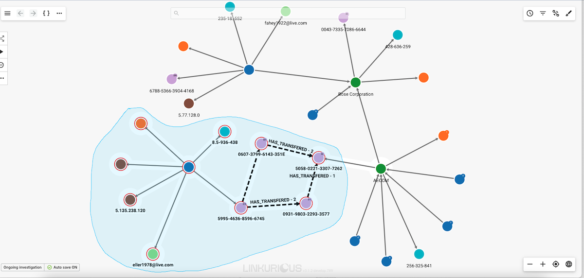
Release the mouse when you are finished and your selection is activated.
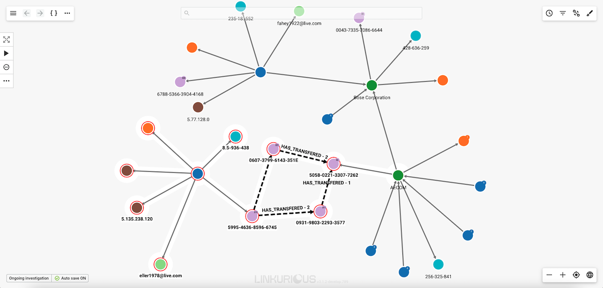
Your visualization is getting too complex and you may want to remove from a visualization (i.e. hide) a few nodes or edges from a visualization to make it easier to understand. Notice that hidden nodes an edges are not deleted from the database.
In the picture below, three nodes are selected.
Simply click on the Remove icon to remove them from the visualization.
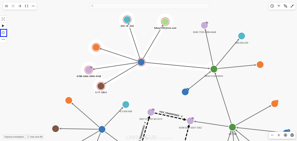
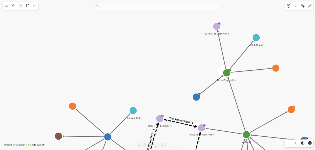
The six nodes are now removed from the visualization.
The Toggle Lasso option can be used to select the nodes we want to hide. We need to make sure the central node is not selected, otherwise all the edges connected to this node will also be hidden.
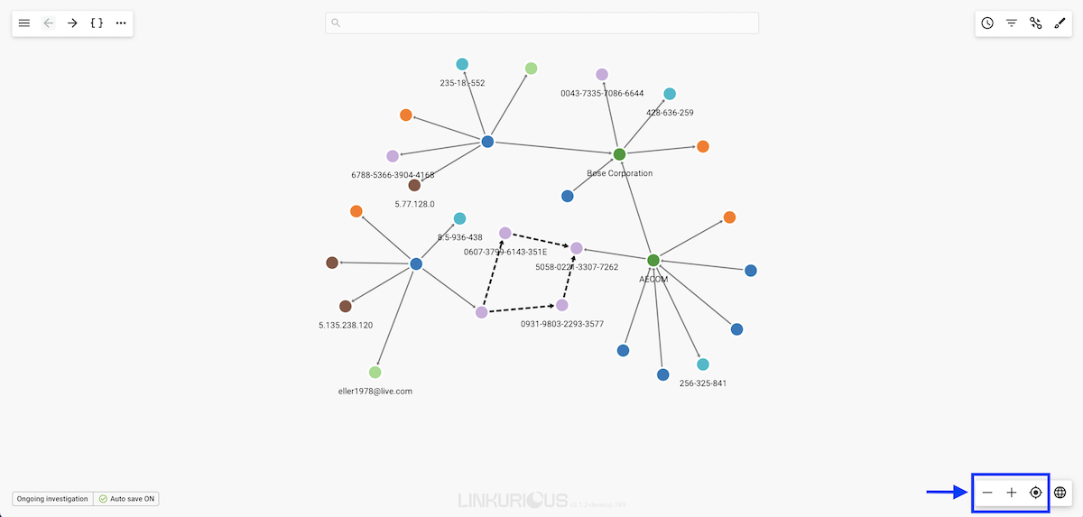
At the bottom right of the workspace there are controls allowing to "Zoom in", "Zoom out", and "Locate", i.e. center the screen on the current selection.
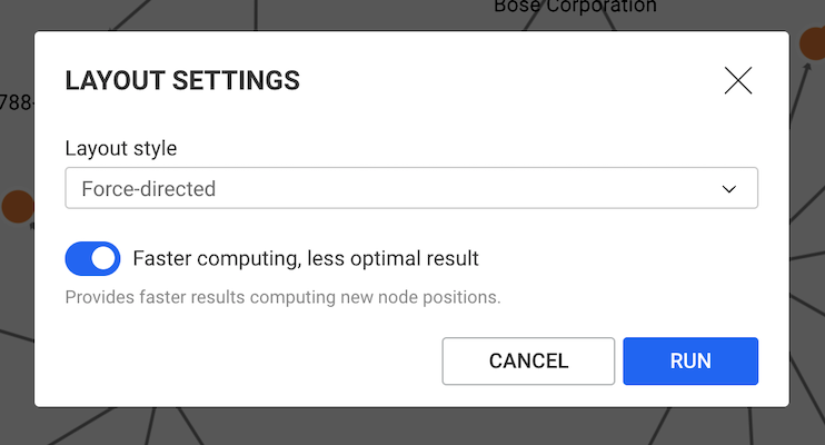
Using a layout on the graph brings clarity. To refresh the current layout, right-click on the background, or click on the "More" menu at the top of the workspace, and choose "Refresh layout" in the context menu. To apply another layout, choose "Layout settings".
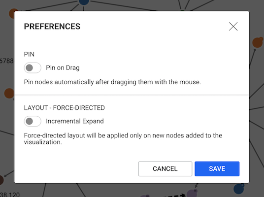
By default the layout is run automatically on the whole graph in some conditions, such as when an expand is performed. It is possible to switch to an "Incremental expand" mode in the Preferences (located in the workspace menu).
This is the default layout, enabled in "fast mode" option. You may turn this option OFF for better looking but slower results.
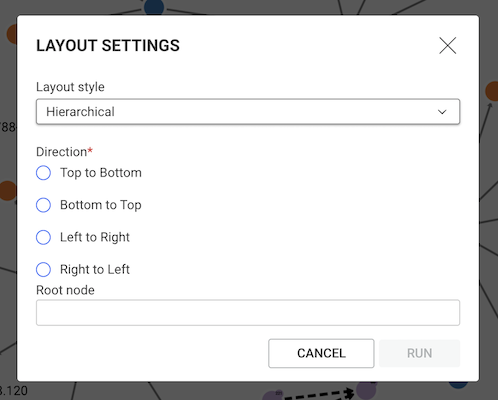
The hierarchical layout organize nodes in different layers by aligning nodes of each layer vertically or horizontally. It produces a tree-like structure if there is a single root node (the node at the top of the tree):
You may choose a root node. You may choose the orientation, for instance "Top to bottom" places the root node at the top.
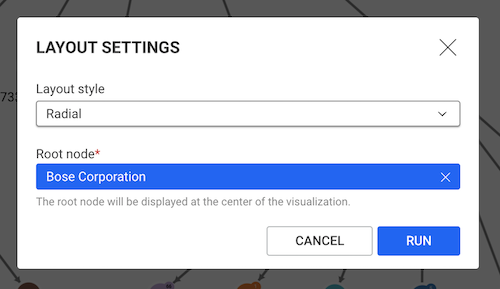
Radial layouts position nodes around the currently selected node (used as center of the layout) based on their graph-theoretical distance (shortest path in the graph). This is useful for revealing layers in data and for drawing the rest of the graph in its relation to the pre-defined focus node.
You must choose a root node.
Example:
It is possible to pin the nodes on your graph visualization. Pinning a node allows to fix it at a specific place on the graph.
To pin a node, we can either select Pin on the tooltip opened by right-clicking,
or click on the ... in the actions menu.
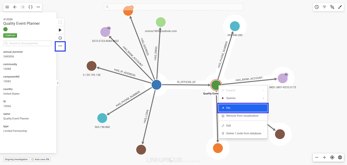
A pin symbol appears on the node.
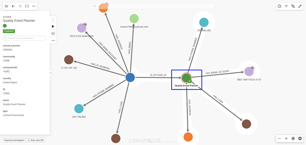
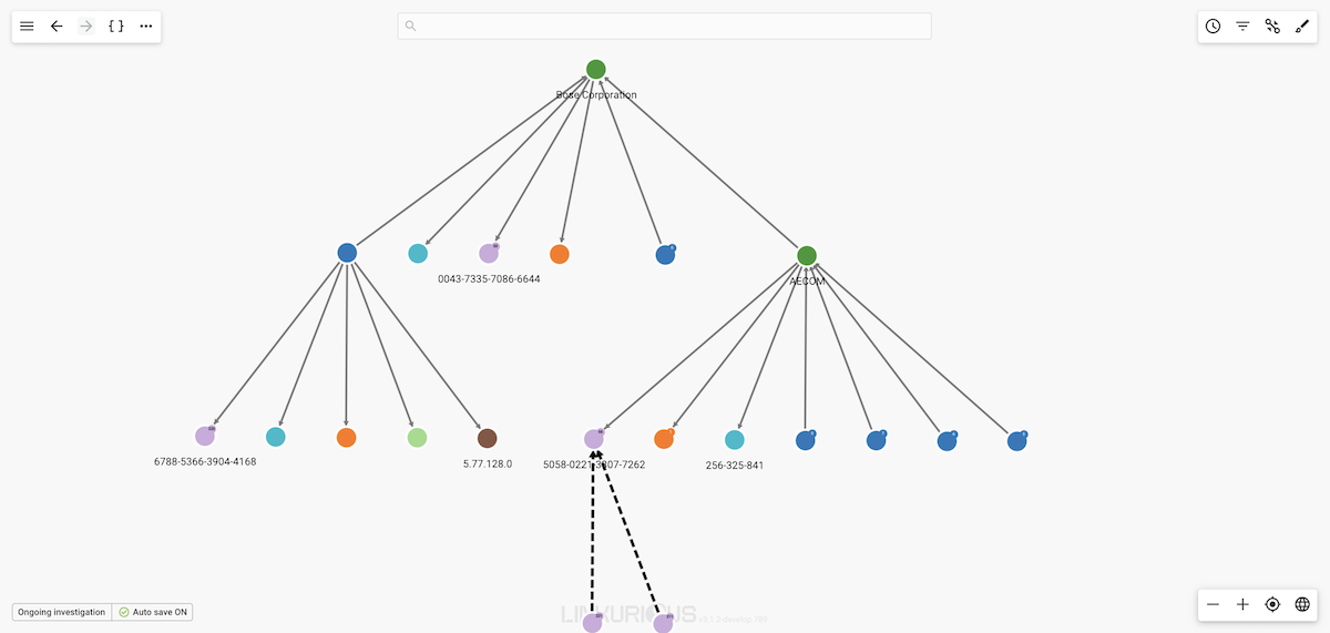
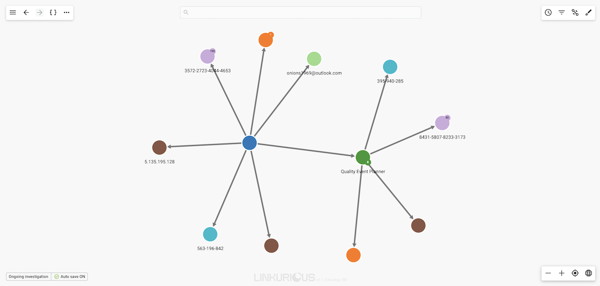
If we pin a node, this node will stay at the same place when we move the rest of the graph, for example using the force-directed layout option:
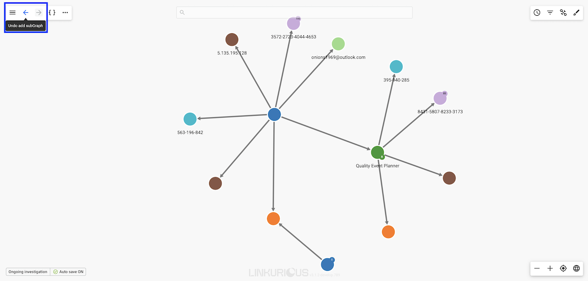
You now have the possibility to revert your last action on a visualization.
You can revert only the last action you do in the visualization.
For example, after expanding a node, clicking the undo button
(or using the shortcut ctrl-z or cmd-z on MacOS) will revert the expand by returning the graph to its previous state.
After reverting the expand, you can go back and re-run it by clicking on the redo button (or using the shortcut ctrl-y or cmd-y on MacOS).
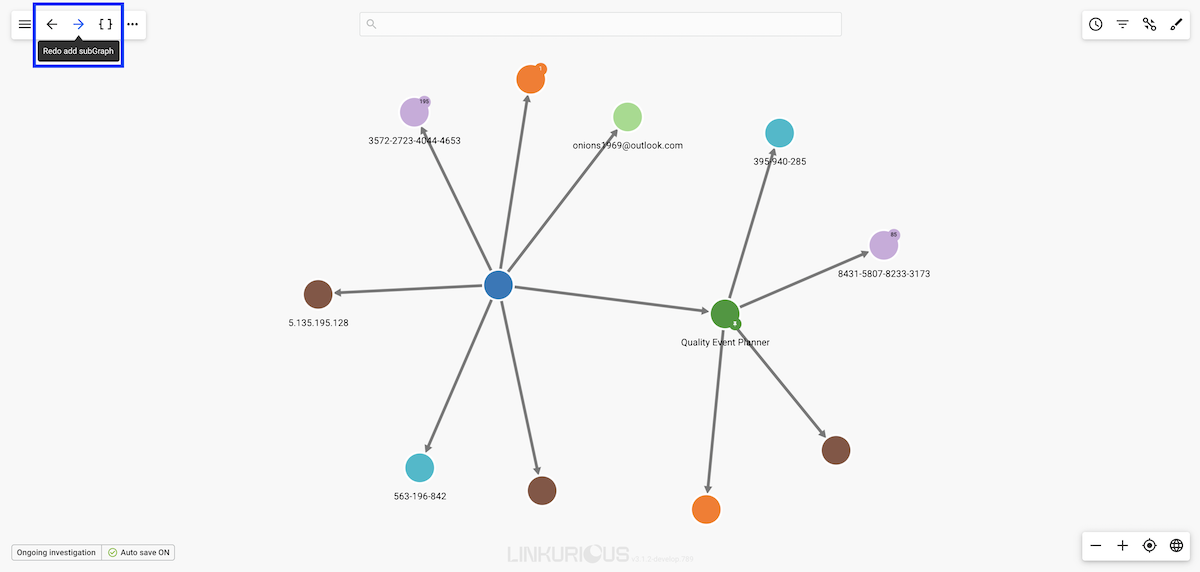
We have now the same nodes in the same positions as before.
Some actions cannot currently be undone :
Depending of your operating system, you will have to use the ctrl key (Windows, Linux) or the cmd one (MacOS) to trigger actions.
← Move camera left↑ Move camera up→ Move camera right↓ Move camera down+ Zoom in- Zoom outctrl/cmd + click Add/remove nodes or edges to the selectionctrl/cmd + a Select/deselect all nodesctrl/cmd + backspace Hide selected nodes or edgesctrl/cmd + drag Use lassoctrl/cmd + e Edit selected node or edgectrl/cmd + z Undoctrl/cmd + y RedoIn this chapter, we'll learn how to adjust the captions, the colors and the sizes of nodes and edges. This will help you make your visualizations more meaningful.
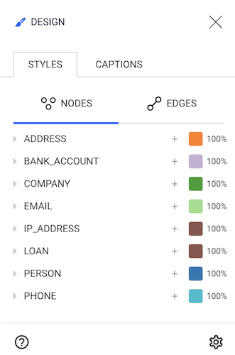
All these features are available on the Design panel that can be open by clicking on the following icon on the right top of the screen:
![]()
The Design panel will open with the Styles and Nodes tabs pre-selected:
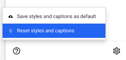
Styles set in a new visualization are automatically re-applied to newly created visualizations. Users can reset their styles to default styles at any time from the gear icon at the bottom-rigth part of the Styles or Captions panel.
Default styles may be defined by an Administrator of Linkurious Enterprise. Users can then change these styles after creating or opening a visualization.
By default, every node category has a pre-assigned color.
Linkurious Enterprise lets you choose which properties should be displayed on the workspace next to every node and edge.
On the example below, only the names of the nodes are displayed by
Linkurious Enterprise.
In order to customize this, we need to open the Design panel and select the Captions tab.
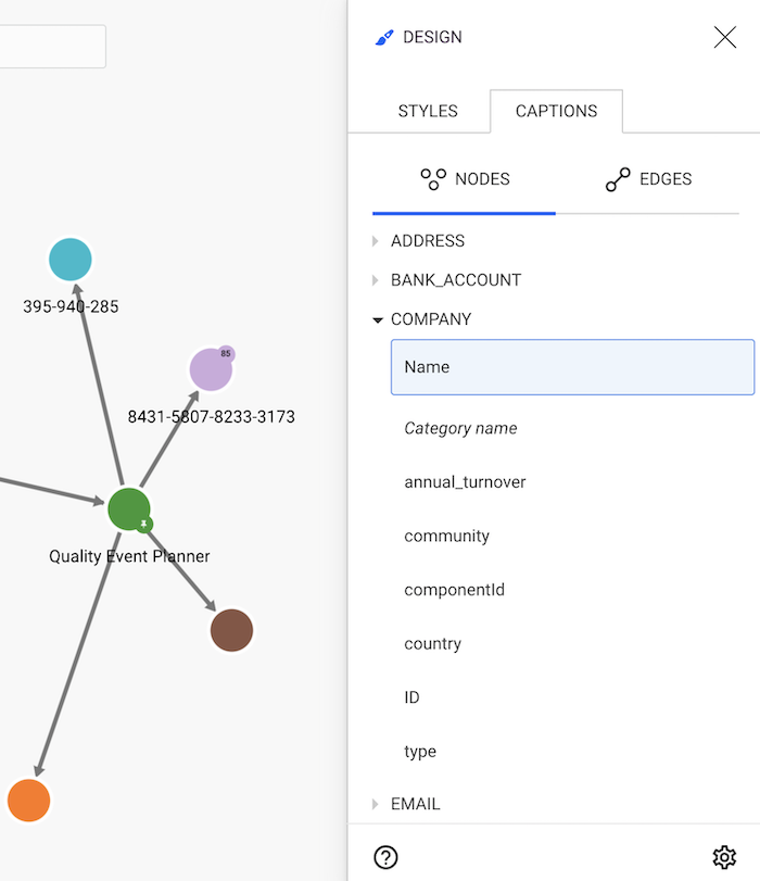
On the Captions tab, we can see the different properties of the nodes
in our graph. The Name property is currently the only one shown. Let's add then the Country to the visualization;
to do so, we click on Country. This property is now added to the displayed
properties listed in the red area.
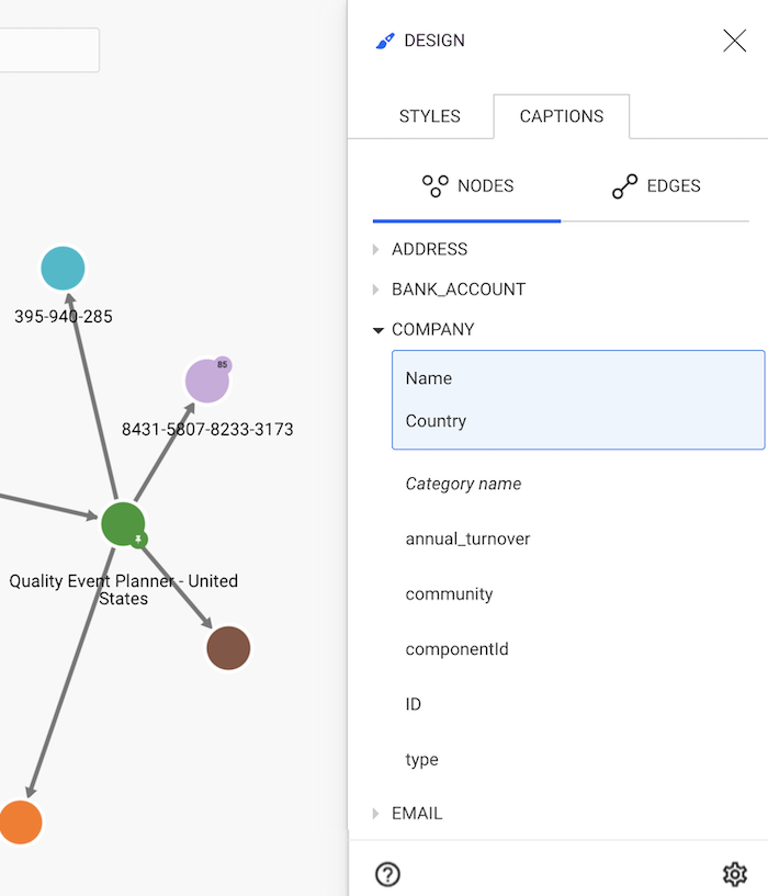
The text displayed next to the nodes is now different:
instead of Quality Event Planner we can see Quality Event Planner - United States.
The same approach can be used for the edges, whose list is available on the Edges tab.
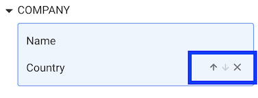
Linkurious Enterprise will use the properties in the order they appear in the list. By placing the cursor on one property already in the caption list, we have the possibility to change the order or to remove properties.
If a node doesn't have a property, Linkurious Enterprise won't show a caption for that property for that node.
If all your nodes or edges have the same color, it is difficult to distinguish them without looking at their individual properties. A great way to solve this is to color the nodes according to a certain category or property.
For example, our nodes with category LOAN may have a type property that we would like
to highlight; Linkurious Enterprise enables us to color the nodes according to a particular property, here type.
This way, a condo and a house loan will have different colors despite having the same category; it will be easier to distinguish them visually.
In the picture below, we see that company Hello New World Ltd is connected to many loans. At first glance we have no idea where these loans are for.
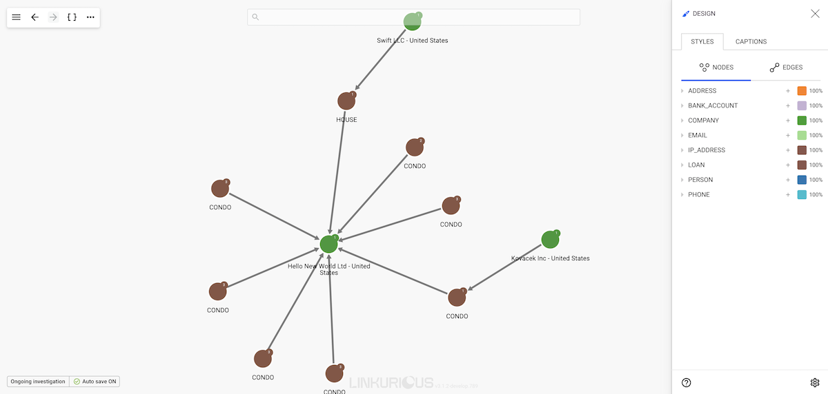
Let's open the Design panel on the right corner of the screen and hit the Styles tab.
We can see all the node categories and, clicking on them, we can see their properties and property values.
Clicking on the desire property we can see all the values from the nodes in the visualization; from here, in two steps, we can change the color based on a value:
![]()
blue), its hexadecimal color code (e.g. #0000FF)
or its rgb, rgba (e.g. rgb(0, 0, 255), rgba(0, 0, 255, 1))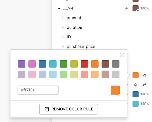
We repeat the process until we have a new color for each value:
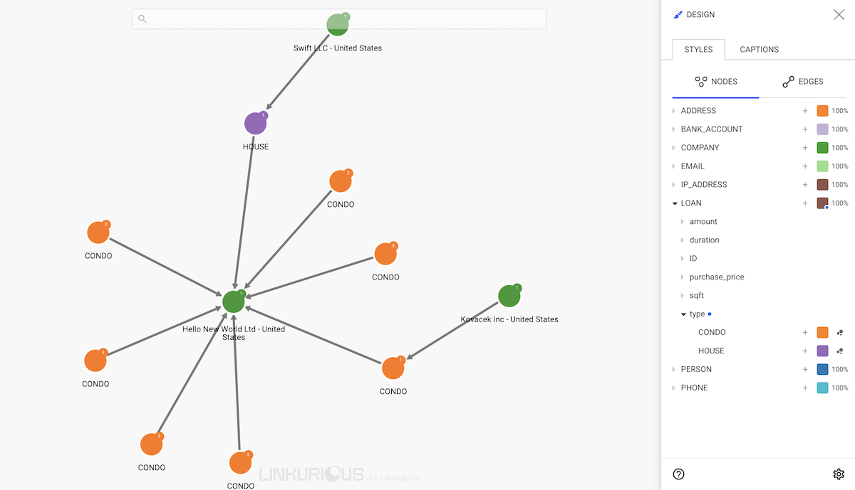
All the nodes that do not have the property or none of the values for which we applied a rule will remain with the color of their category.
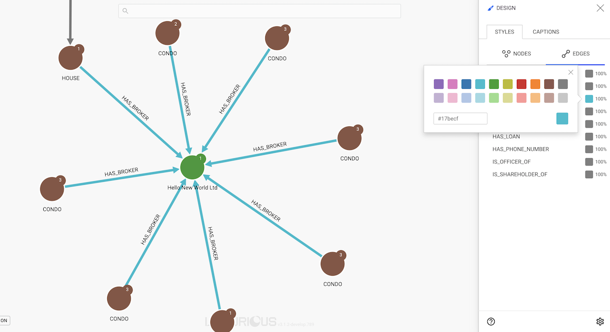
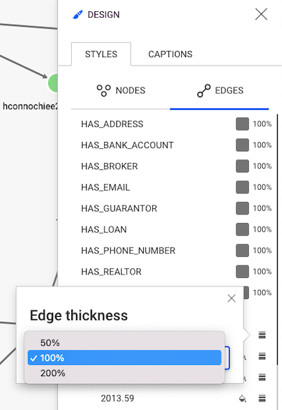
Coloring edges works exactly the same as coloring nodes.
We only need to click on the Edges tab of the Design panel and choose a given color based on the type of an edge or the value of an edge property:
By default, all the nodes have the same size.
It is possible to apply different sizes to nodes depending on their categories and/or property values. This makes it possible to differentiate nodes with a specific category and/or property.
There are two ways of applying a style for the size: Static and Dynamic:
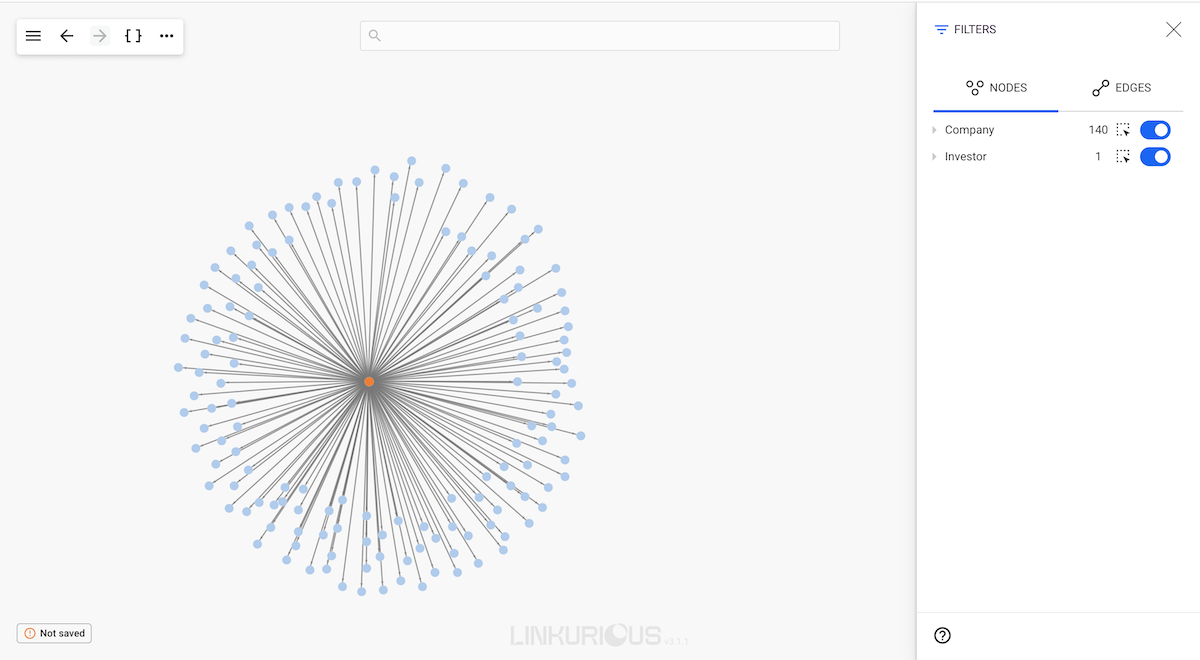
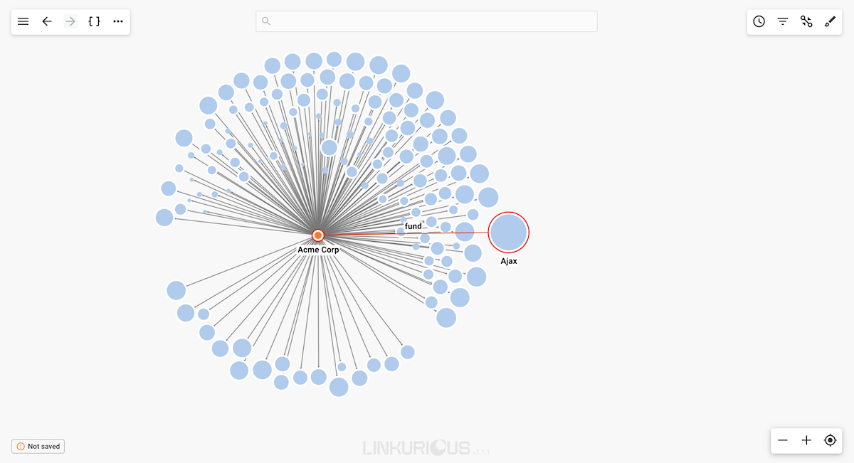
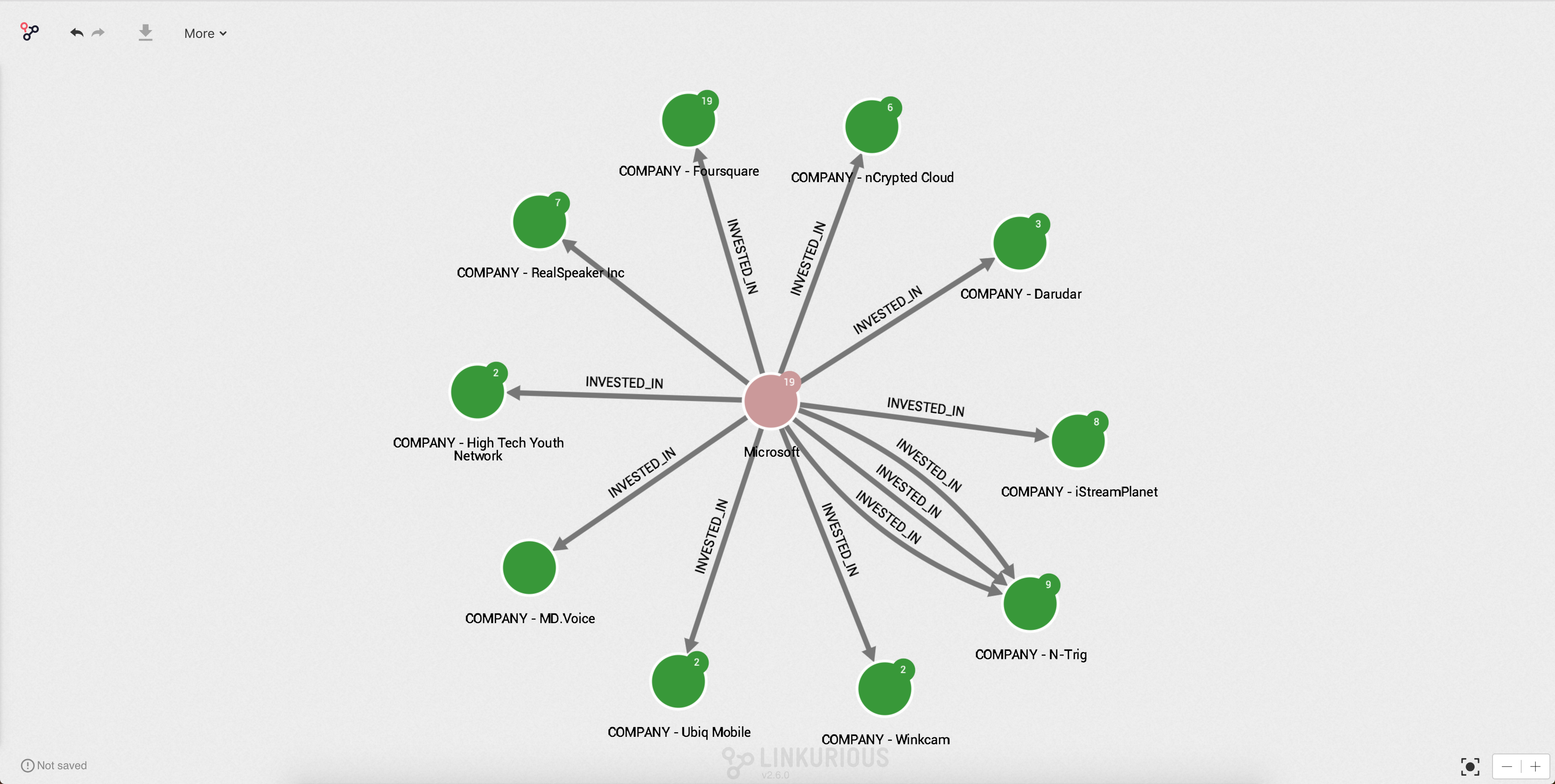
Static sizing works similarly to the coloring functionality of Linkurious Enterprise.Dynamic sizing allows the analyst to visualize the graph using a scaling function, which helps in immediately distinguishing important values.For example, the following visualization represents 140 companies that received funding from Acme Corp VC firm. Which companies received the biggest funding? Hard to know by simply looking at this graph:
We are going to dynamically size the different companies according to their
funding_total property in order to visualize which ones are the most
successful. For that, let's use the Linear scale function.
Company.Linear option then select Logarithmic.funding_total property.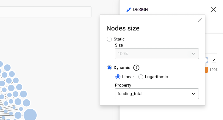
Now we can see that the size of the nodes with the category Company has changed – the larger the size of the node
is, the bigger the funding total value is.
We can quickly identify the most successful investment of investor "Acme Corp".
Setting sizes on edges works exactly the same as setting sizes on nodes.
We only need to click on the Edges tab of the Design panel and choose a given size based on the type of an edge or the value of an edge property:
Linkurious Enterprise allows you to change the appearance of nodes by adding icons, letters or numbers.
We open the Design panel and choose the Styles and Nodes tab:
![]()
We can now see all the node categories and apply an Linkurious Enterprise icon, letter, number or custom icon to each one of them in three steps:
![]()
![]()
![]()
![]()
![]()
See how to add custom icons on our administrator manual. After adding the desired images they will be visible on the custom icons section and can be applied like a regular icon.
![]()
It is also possible to apply icons based on node property values.
In the example above, we have chosen 4 different icons to differentiate the nodes according to their category:
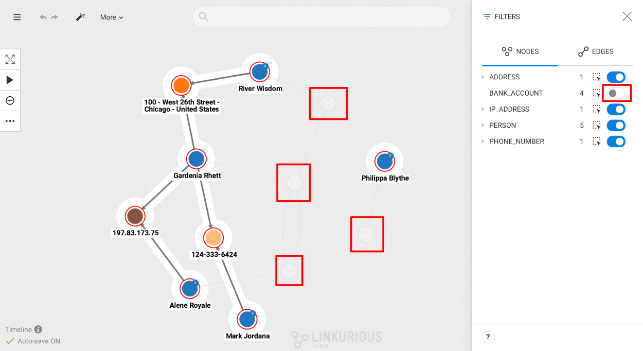
Cities are represented with a Home iconCompanies are represented with a Rocket iconInvestors are represented with a Diamond iconMarkets are represented with an Institution iconIn this chapter, we will learn how to filter the nodes and edges within a visualization according to their category/type or property values.
This technique will help you to focus on the relevant information in your graph and avoid information overload.
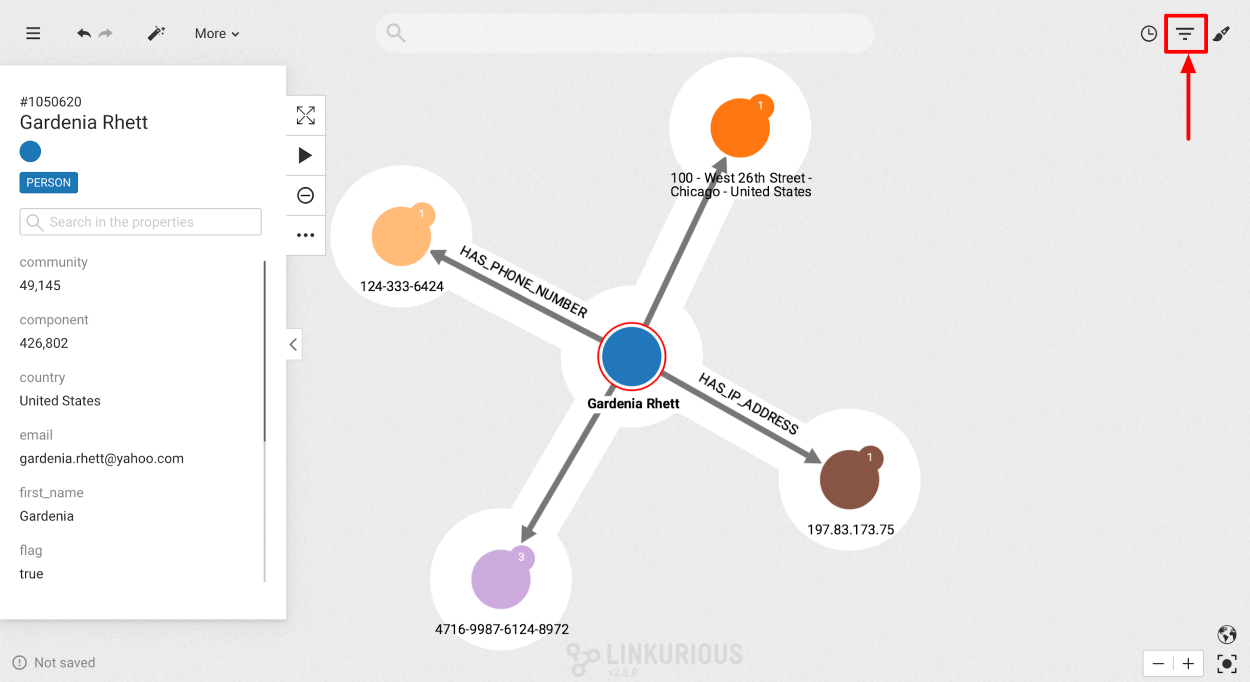
Open the Filter panel using the funnel icon in the top-right corner. It contains:
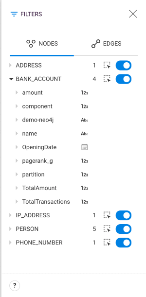
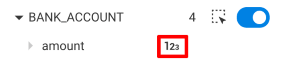
The type of a property is represented with the icon next to the property name.
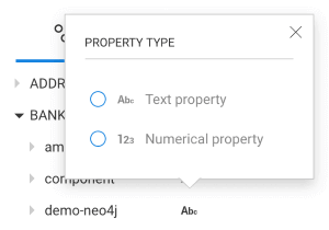
There are 5 possible types:


If the property type was not set in the Schema, it was automatically detected by the visualization as a String or a Number property.
If it is not detected as the correct type, you may change it by clicking on the type icon.
Click on the toggle button next to a category to hide all the nodes matching that category.
All "hidden" nodes are displayed in light grey in the visualization.
Click the toggle again to show those nodes again in the visualization.
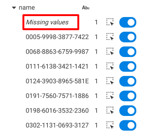
To filter on properties, unfold a property in the category tree. Filtering options depend on the property type.
For a String property, all values found in the visualization are listed. For each value:
Also a "Missing values" row is displayed when some nodes don't have that property.
Enumerations accept only the authorized values declared in the Schema. All other values are considered as "invalid". Nodes that don't have the property are considered as "missing values".
True/False accept only "true" and "false" values. All other values are considered as "invalid". Nodes that don't have the property are considered as "missing values".
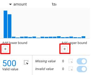
The chart displays all the property values taken by the nodes that hold a value for that property.
By clicking on the "+" icons, you can filter based on the property value by adding a lower bound and/or an upper bound:
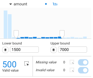
It is possible to:
Nodes in the visualization:
It is possible to hide all nodes that have a missing value or an invalid value. They are displayed by default.

Date and Datetime properties can only be filtered using the Timeline.
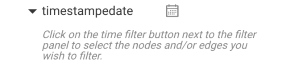
The Timeline is available if at least one property has been set as Date or Datetime property by the administrator in the schema.
The Timeline panel can be open through the "clock" icon in the upper right corner of the workspace.
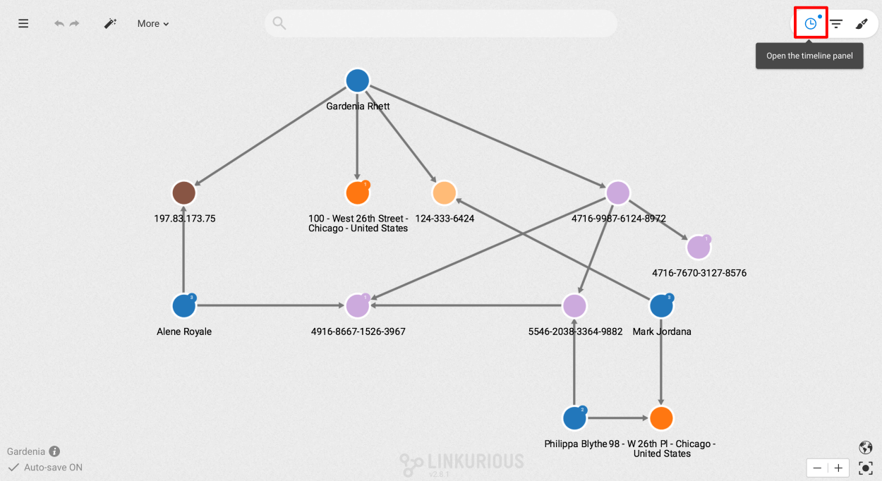
The Timeline displays the distribution of values of one or multiple properties at once.
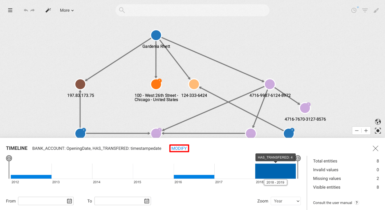
In the top left corner of the panel is displayed the list of properties being plotted in the Timeline. You may change the list of selected properties by clicking on the "Modify" button next to that list.
At the bottom right, the zoom level allows to change the step of the histogram.
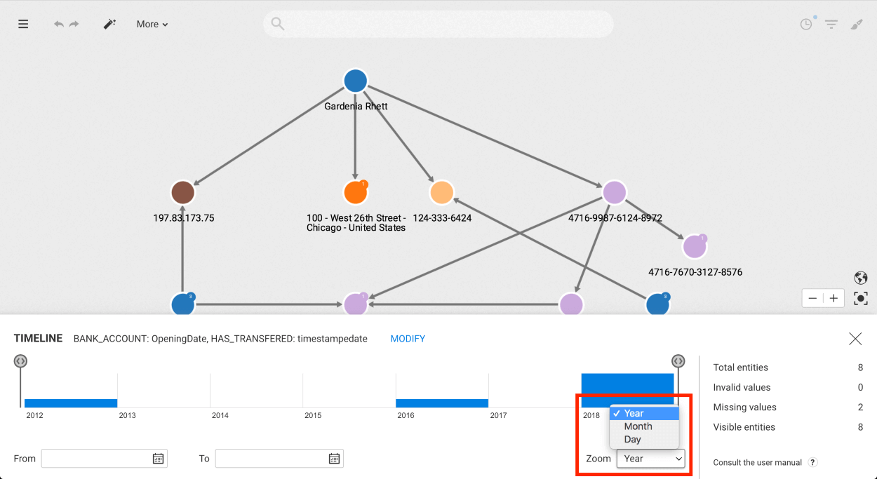
It is possible to filter nodes and edges holding the properties selected in the Timeline by adding a lower bound and/or upper bound using:
To remove a bound, clear the corresponding date picker.
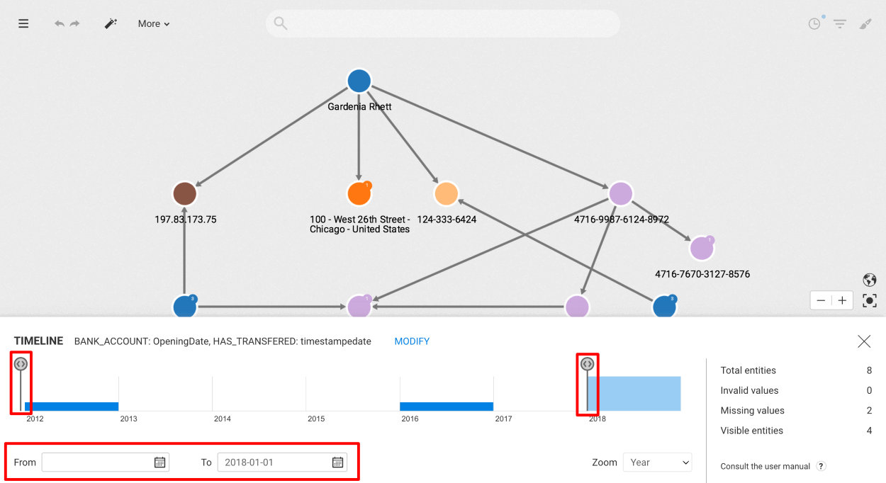
Some statistics are displayed on the right-hand side of the panel:
In this chapter, we will learn to edit, add and remove nodes or edges to our graph.
Important note :
The Linkurious Enterprise team recommends, as a best practice, not to go beyond the following :
- Maximum number of properties per node/edge : 300
- Maximum property key length : 500 chars
- Maximum property length : 200kB (200k characters)
Linkurious Enterprise best performances are not guaranteed beyond these limits.
Nodes are made of one (or multiple) categories, and a set of properties. Edges are made of one type, and a set of properties.
Properties are simple key-value pairs (e.g. name: "James", age: 31).
Node categories are used to tag a node (e.g. Company). Some graph databases (e.g. Neo4j) support multiple node categories.
Edge types are used to define the nature of an edge (e.g. FRIEND_OF).
Editing a node (resp. edge) allows for 3 kinds of actions:
Editing permissions are related to the configuration of Access Rights. If you are not able to edit a node (resp. an edge), see a specific property, or perform one of the above actions, please get in touch with your administrator.
It is a limitation of most graph databases that the type of an edge cannot be edited once the edge has been created.
If we select a node or an edge, we can edit it by right-clicking on it or clicking on
the More option in the Selection panel.
An Edit option is displayed in the context menu unless you are not authorized to edit that node (resp. edge).
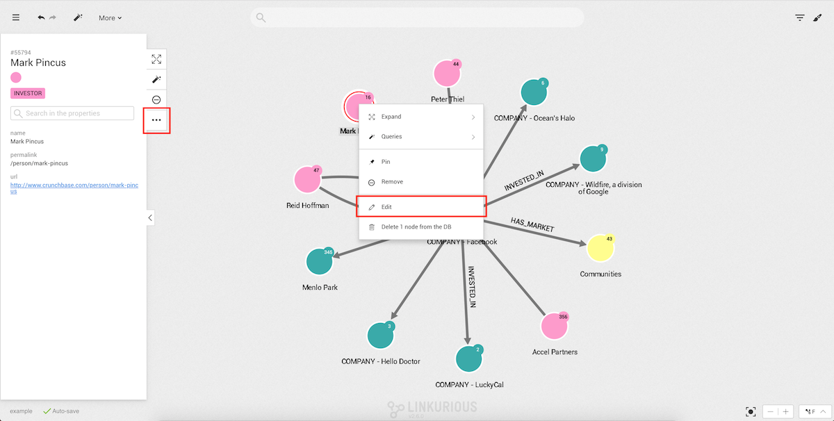
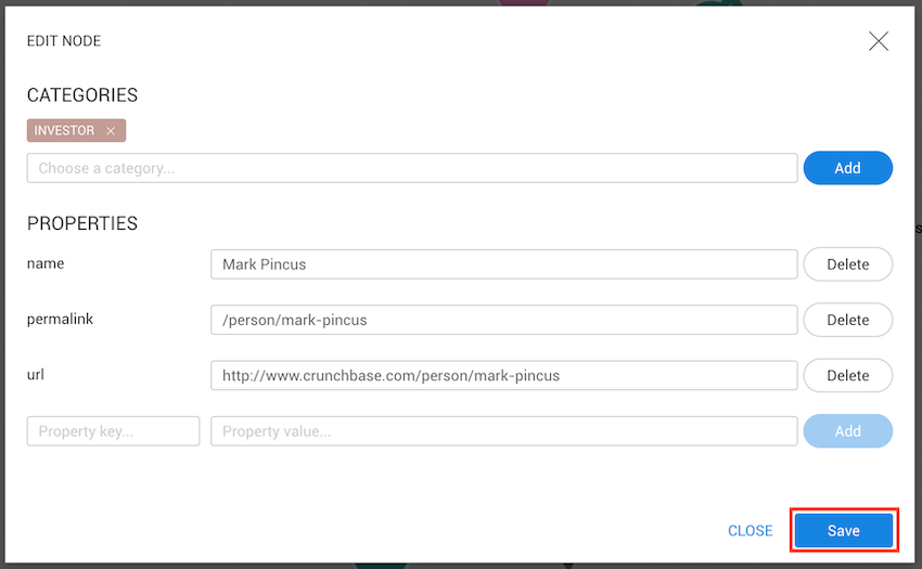
Next, we click on Edit, which will open the node or edge edit modal.
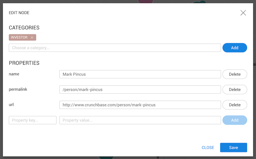
Only available on nodes
To add a category to a node we need to type the desired category. After typing the first character, categories already present in the database that match will be shown. The first option on the list is to create a new category with that name.
A node needs at least one category. It's impossible to create a node without one.
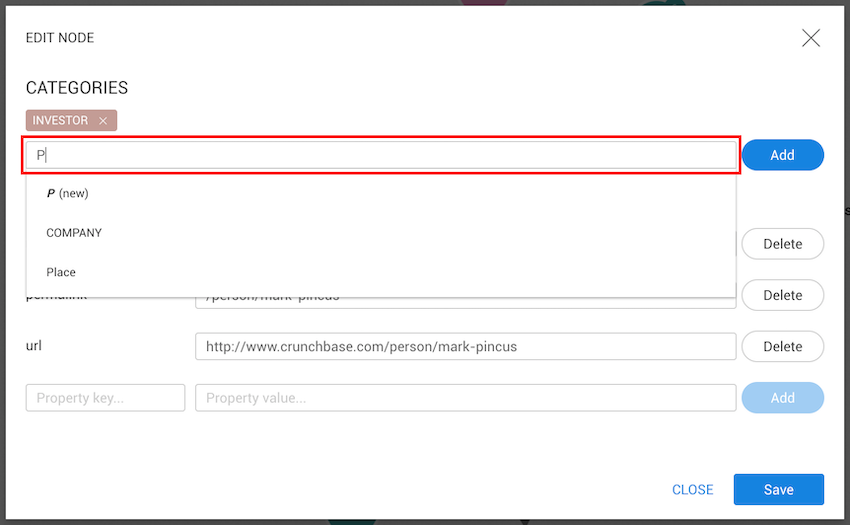
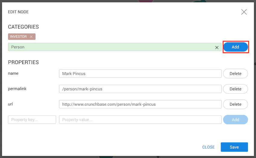
To select one category (even new), we need to click on the list. If the input changes
its color to green, your choice has been accepted. Next, we click on the Add button and, if we
want to save the changes, on the Save button.
To remove a category, we need to click on the cross on the right side of the category.
If a node only has one category, it cannot be removed.
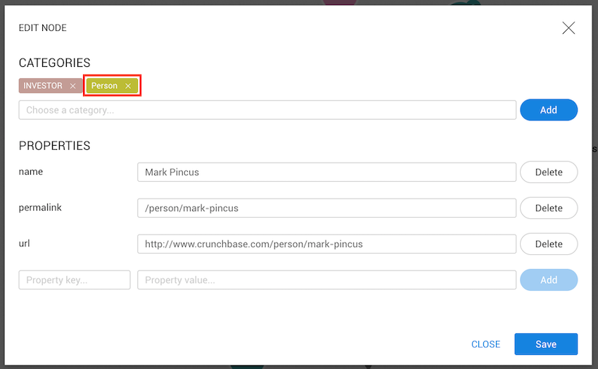
These changes will only be saved after clicking on the Save button.
Note: edges can only have one type, therefore it is not possible to either add, remove or replace an edge type.
To edit an existing property, we only need to change its value. An administrator has the ability to configure the type of a property:
Text property can be edited through a text input.Number property can be edited through a number input.Enum (a limited list of authorized values) can be edited through a select list.Date or Date & time can be edited through a date picker.boolean) value can be edited through a toggle switch.If no type was configured for the property, it's considered as a Text property.
When editing a property, failure to input a value corresponding to the property type results in an error when trying to save.
Once a valid value is input, click on the Save button.
When the value saved in a property is inconsistent with the type declared by the administrator, a warning is displayed. In order to edit this value:
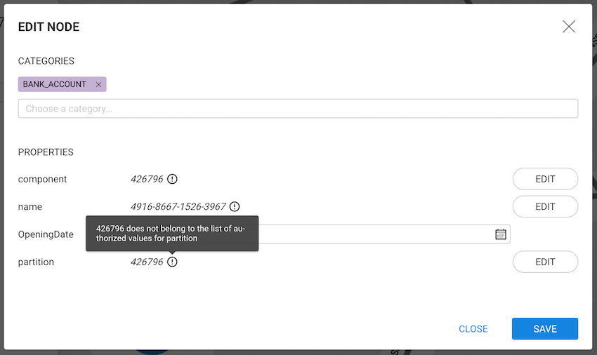
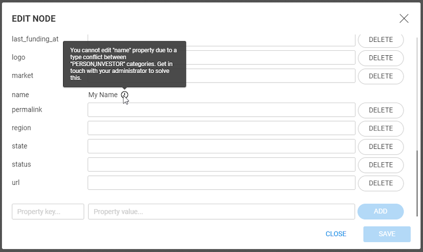
When nodes have multiple categories, properties might be configured so that a single property has 2 conflicting types. For example if the administrator configured:
In such as case, a warning is displayed and the user is not able to edit the property until the administrator resolves the conflict.
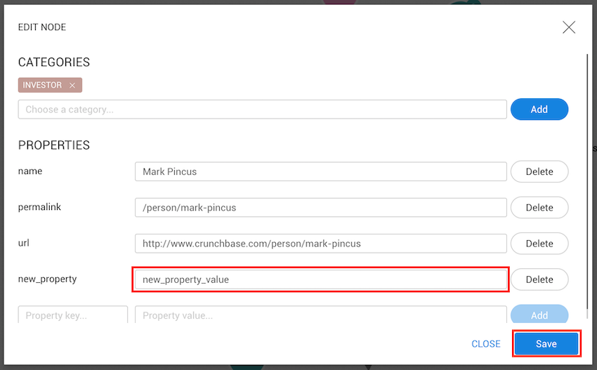
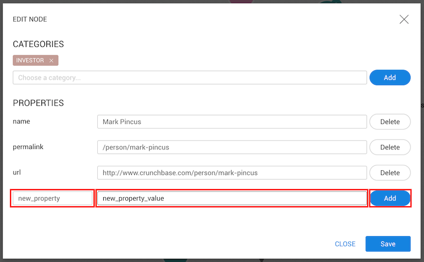
To add a new property, we need to fill in the name of the property and provide a value new_property,
and new_property_value, for example--and click on the Add button.
This property does not have a type yet and so will be considered to have the Text type.
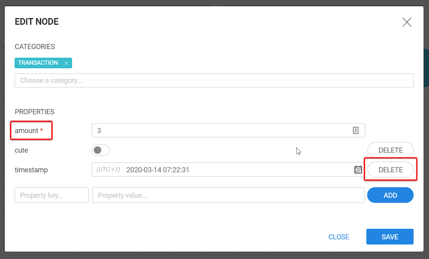
To remove a property, we only need to click on the Delete button. You cannot delete properties that have been marked as mandatory by an administrator. Mandatory properties have a red asterisk.
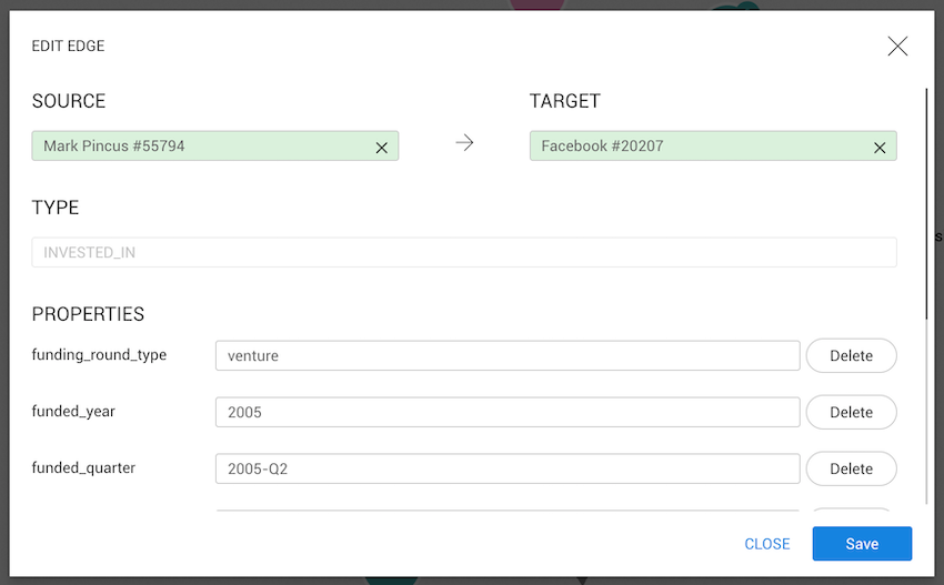
The edge edit modal works exactly the same way
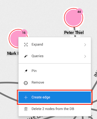
The easiest way to create a node or an edge is to right-click on the background or click on the
More option in the top menu.
For edge creation, we can select one or two nodes and right-click on one of them to automatically use the selected nodes as source and target.
First we need to select or create a new category for the node using the marked input.
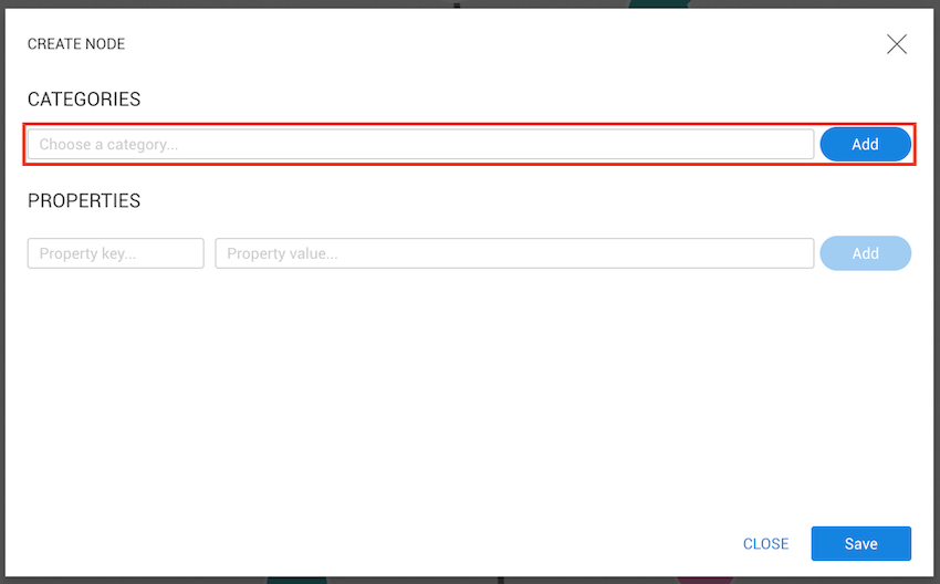
When we begin typing compa the category Company appears on the list along with the
option to create a new category named compa.
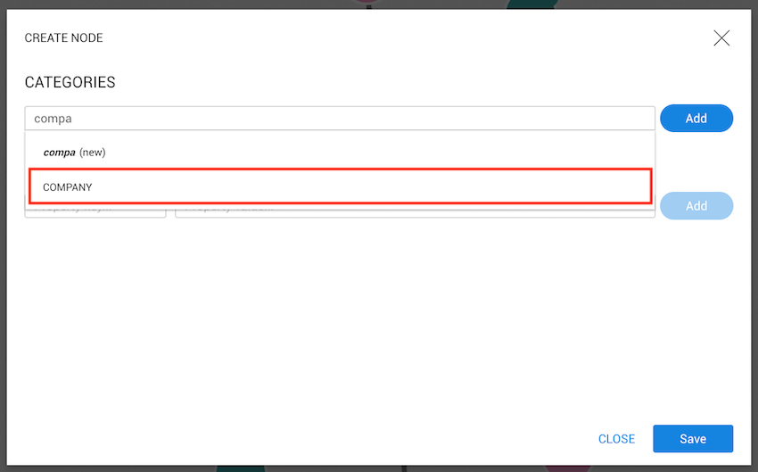
Let's select Company and click on the Add button. The company is then added, and since a category
is already present in the database, the properties list will be filled with those properties
already on Company nodes.
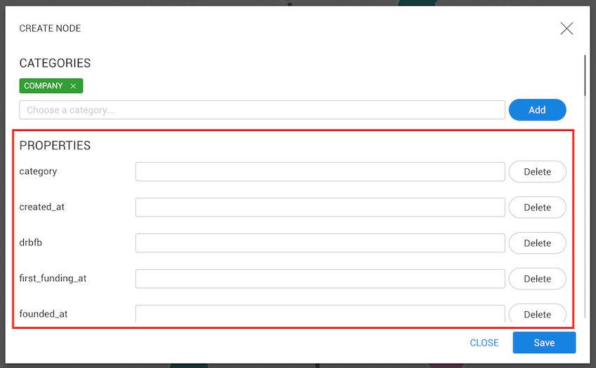
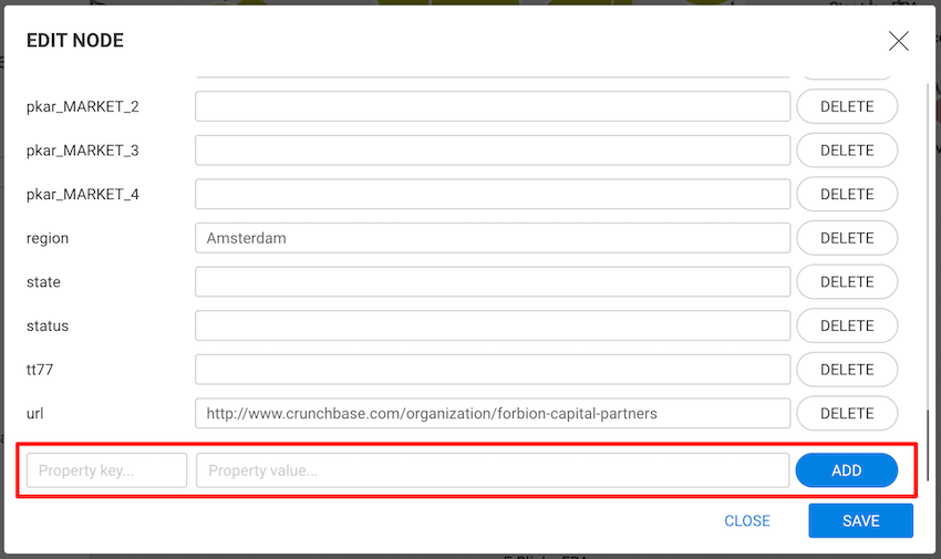
We can now fill the desired properties or create new ones at the end of the list and click the Save
button to add the new node to the visualization.
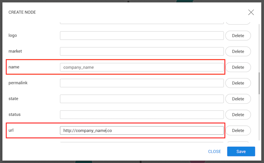
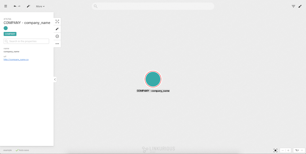
The new node is now saved and added with the inserted data. The node is also automatically selected.
The easiest way to create an edge between two nodes is to select them and then right-click on one
of them or on the More option in the selection panel.
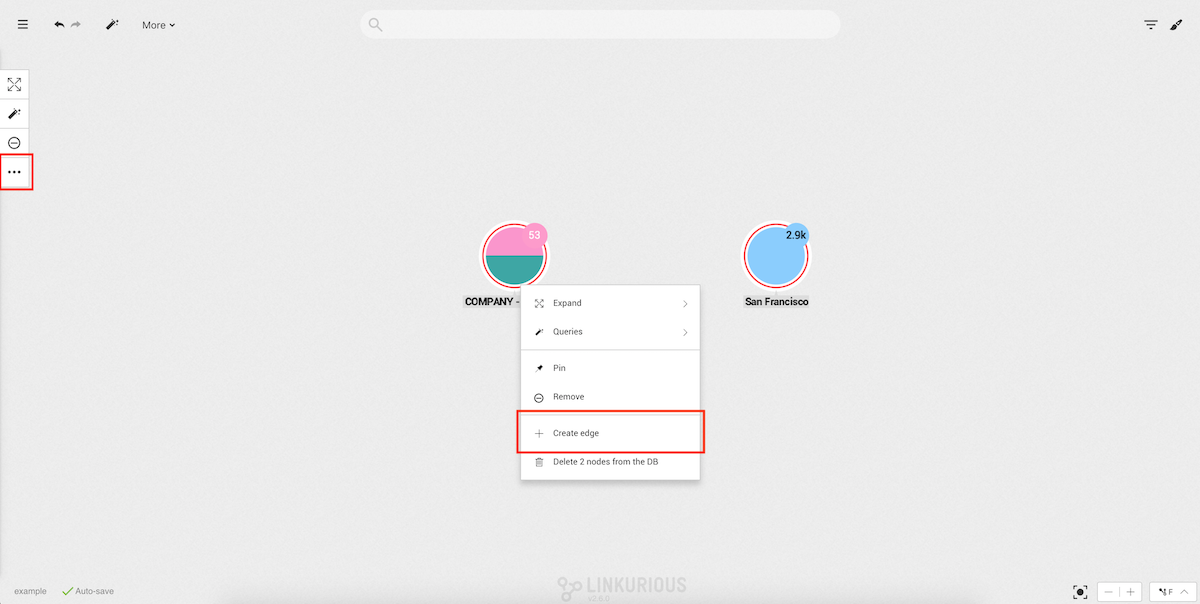
After clicking on Create Edge the edge creation modal will open with three important fields:
Type: the type of edge;Source: the source of the edge;Target: the destination of the edge.Since we already selected two nodes, the target and the source are automatically filled. Using the opposite arrows on top, it is possible to switch between source and target. If we open the edge creation modal without any node selected, we can use the source or target inputs to search for nodes present in the visualization.
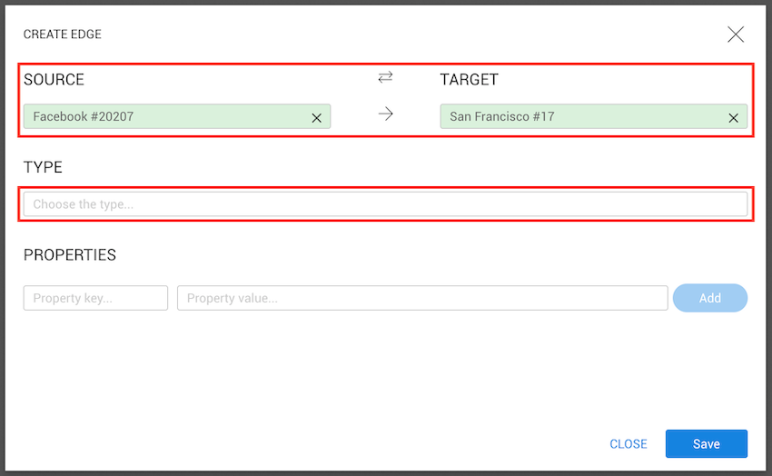
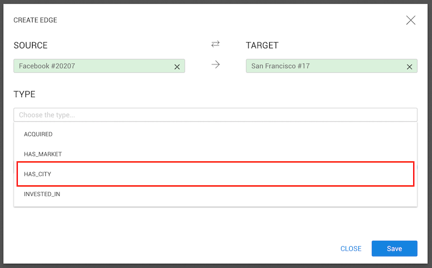
Next, we need to select a type for the edge (unlike with node creation, in edge creation
type is required). Clicking on the type input will show all types present in the database.
Let's select HAS_CITY
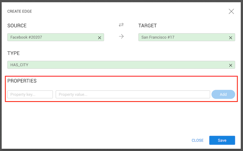
As with nodes, we can add as many properties as we want to an edge.
When we are done, we click on the Save button.
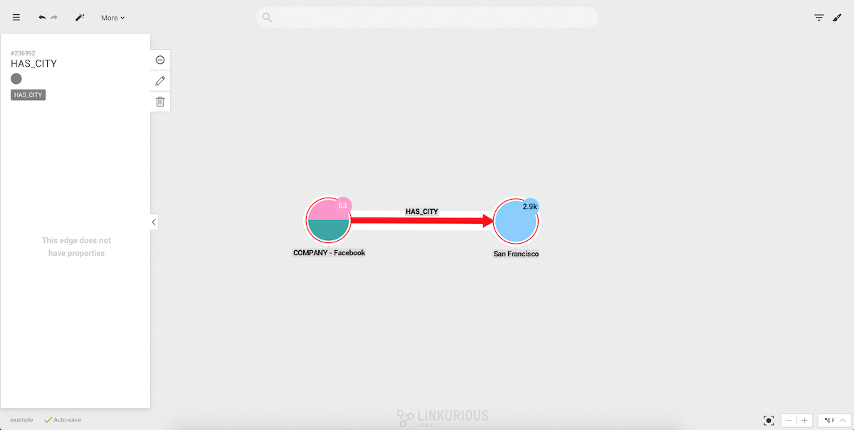
Finally, we can see in our graph our new edge:
It is also possible to create a new edge without selecting any node by right-clicking on the background or by clicking the
Morebutton in the top menu.
If we want to delete one or more nodes from our database, we need to select the nodes we
want to delete and right-click on one of them or on the More option in the selection panel.
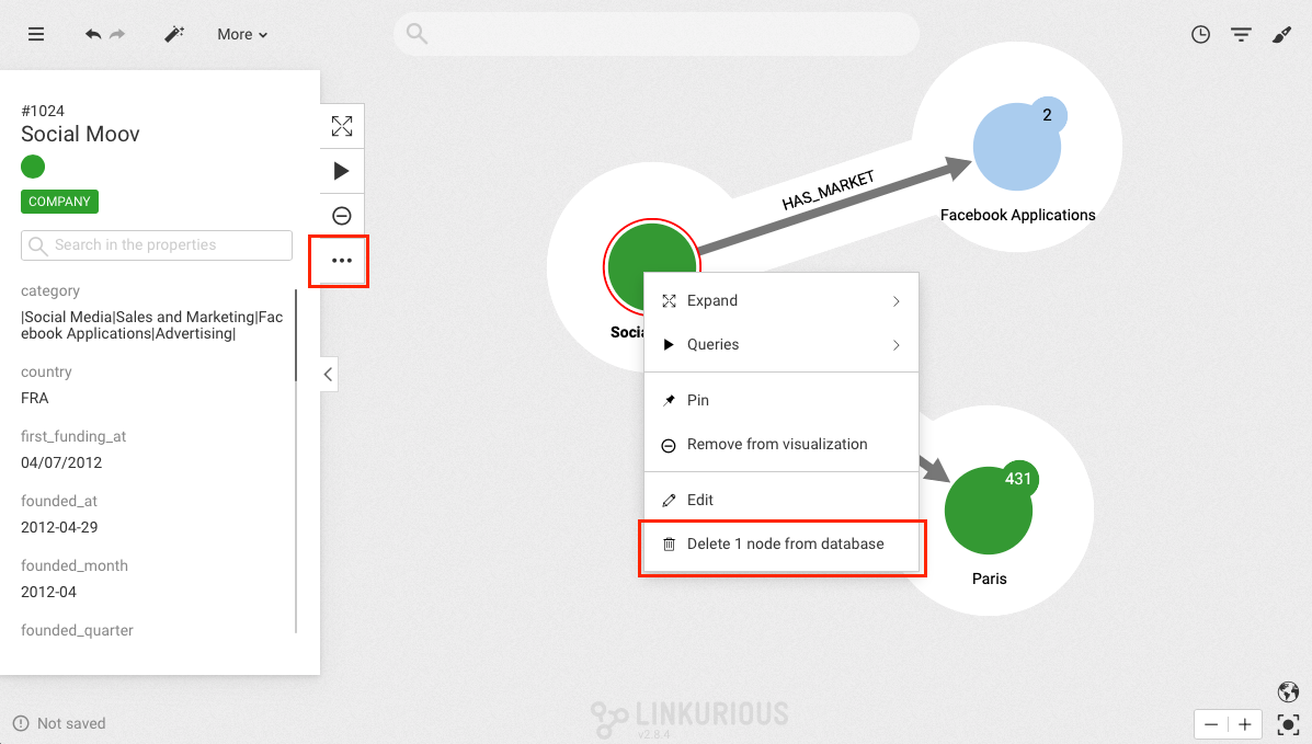
After clicking Delete x node(s) from database a confirmation modal will appear.
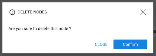
After clicking on Confirm, the node will be deleted from the database.
If we want to delete one or more edges from our database, we need to select the edges we
want to delete and right-click on one of them or on the Delete option in the selection panel.
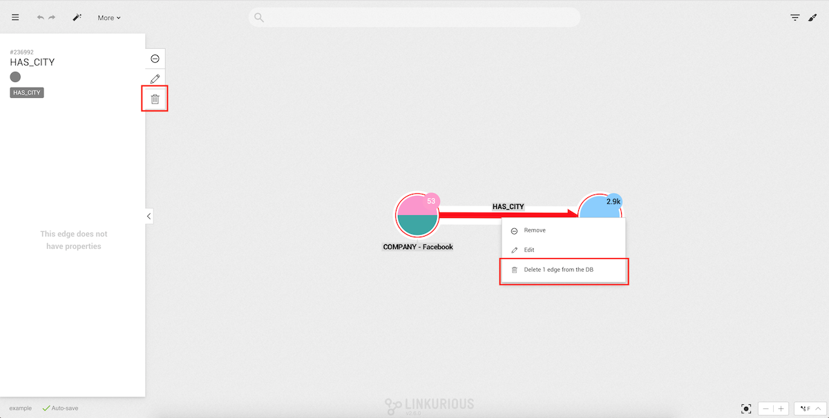
After clicking Delete x edge(s) from database a confirmation modal will appear.
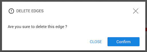
After clicking on Confirm, the edge will be deleted from the database.
In this chapter, we will learn how to display graph data on a geographic map.
Nodes must contain geographic coordinates as properties. Latitude and longitude data must be expressed in decimal degrees (e.g. "38.8897,-77.0089") as available in many geographic information systems (GIS).
The Administrator should configure which property is the latitude property, and which property is the longitude property of the nodes of the data-source. Without configuration, Linkurious Enterprise will try to use properties called "latitude" or "lat", and "longitude", "long" or "lng".
When geographic coordinates exist in a node of the visualization, we can switch to the geo mode.
The Geo mode switch is available in the lower righthand corner of the Workspace. We can enable and disable the geo mode at will to switch between the standard "network" view and the geographic view.
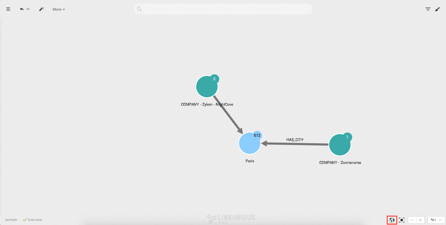
Click on it to display the geographical map. Nodes are positioned on the map according to their geographic coordinates. Other nodes present in the visualization can be hidden by the "geo coordinates" filter.
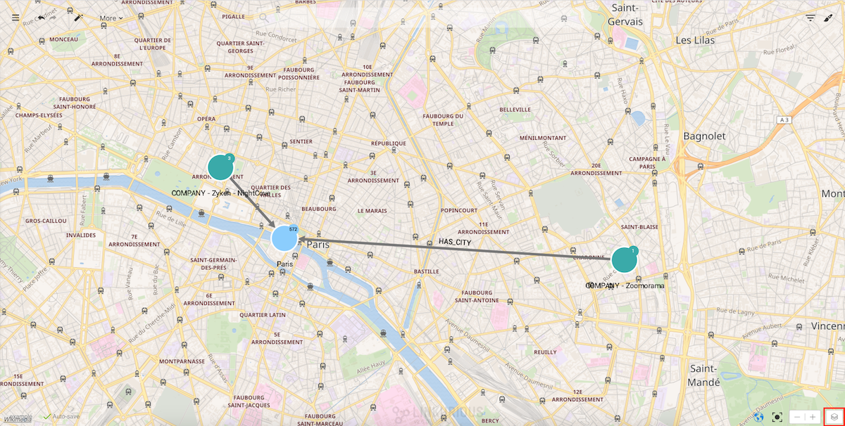
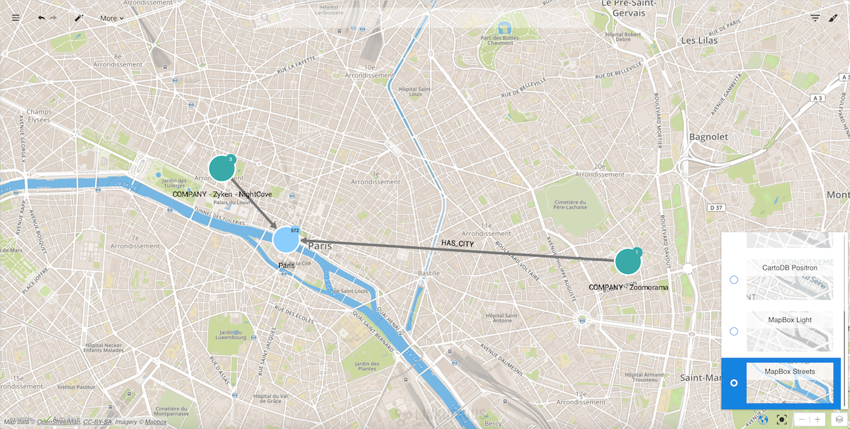
Linkurious Enterprise includes some different layers that can be selected by clicking on the layer button in the lower
righthand corner of the screen.
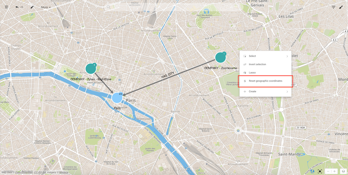
We can zoom in and out, drag nodes on the map to improve readability, select nodes and edges, etc. If we want to move the nodes to their original position we can always reset their coordinates by right-clicking on the background:
Finally, we can publish an interactive widget from Workspace menu > Publish with the geographical layers.
In this chapter, we'll learn how to save and share the visualization created with Linkurious Enterprise.
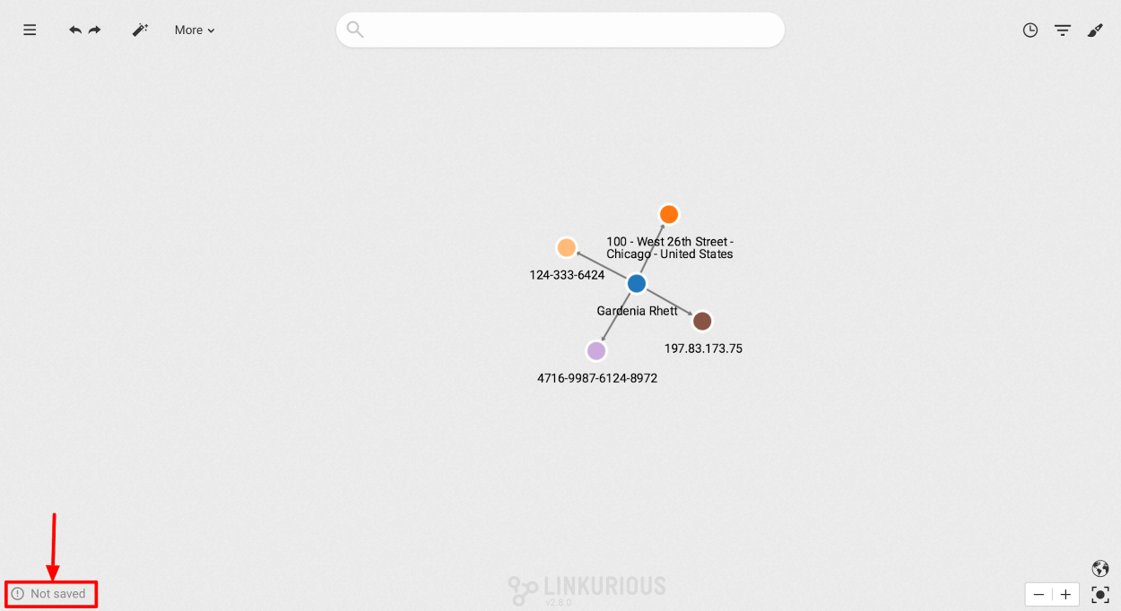
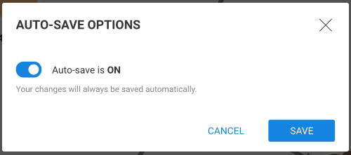
The auto-save status is displayed in the bottom left corner of the workspace. There are 3 possible statuses:

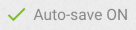

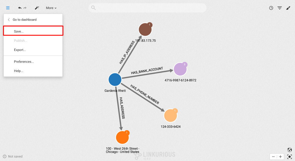
New visualizations are not automatically saved. In order to save a visualization, click on the Menu and then "Save...". Once saved, the Auto-save is switched on.
At the bottom left of the screen click on "Auto-save ON":
Switch auto-save off in the confirmation popup (see below). Auto-save is now switched off: modifications are not saved.
Warning
If you close the visualization and open it again, Auto-save will be ON again.
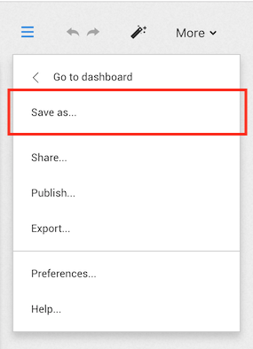
You can duplicate a visualization by clicking "Save as..." in the main menu. The new visualization is open in the current window, and Auto-save is enabled.
Warning
If Auto-save is OFF in the original visualization, any unsaved changes will be lost
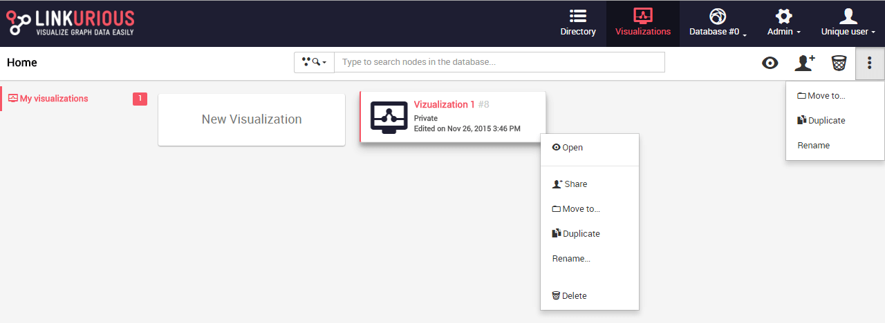
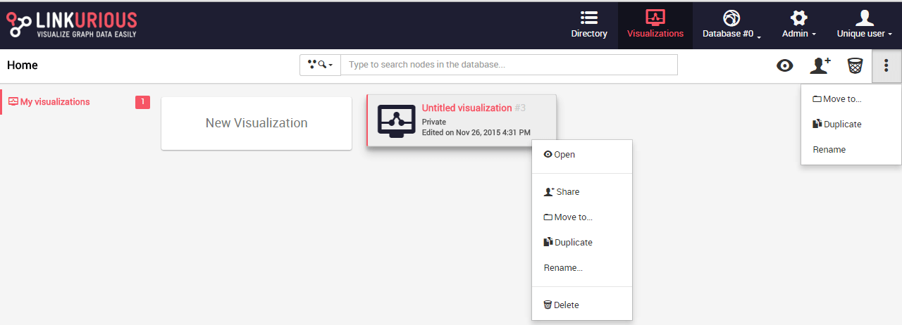
Visualizations are by default added to the Dashboard. From the dashboard we can delete, rename or open a visualization.
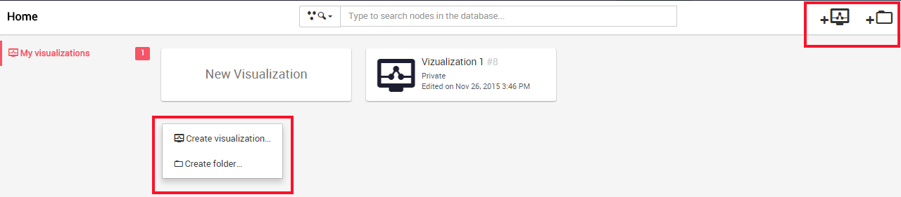
We can also organize the visualizations in folders.
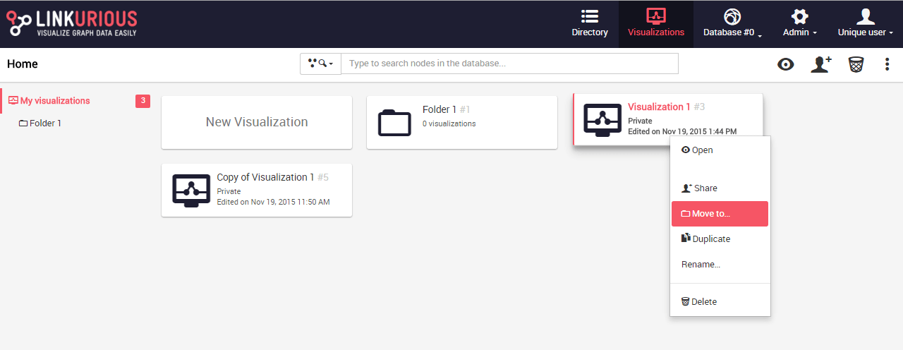
The following actions are possible either when we right-click on a visualization or on the right menu of the dashboard:
To create a folder, we either right-click on the dashboard background or
in the right menu Create folder.
We enter the name of our folder.
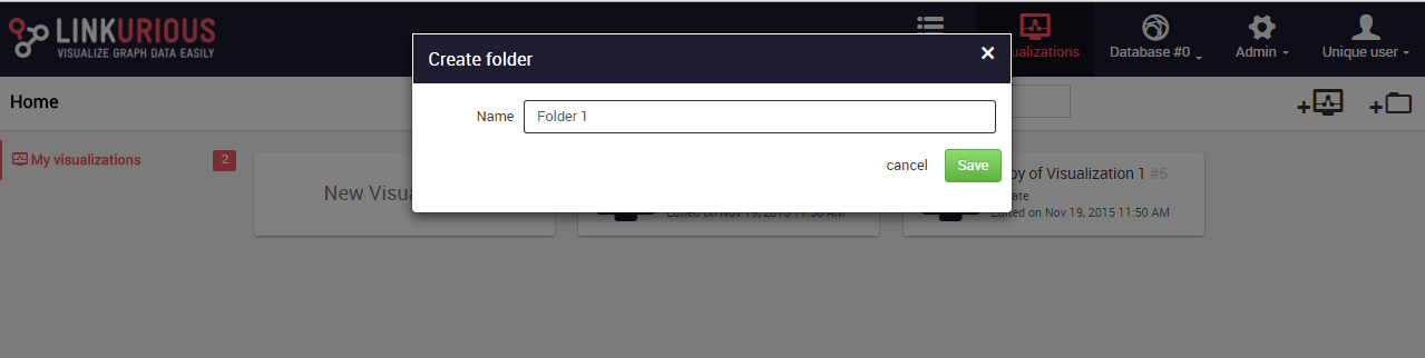
We hit Save. Our folder is created.
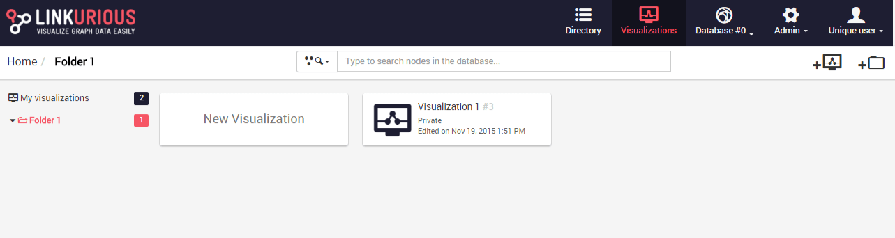
We open the folder by clicking on it.
If we want to move a visualization into the folder we used the actions
move to when right-clicking on our visualization:
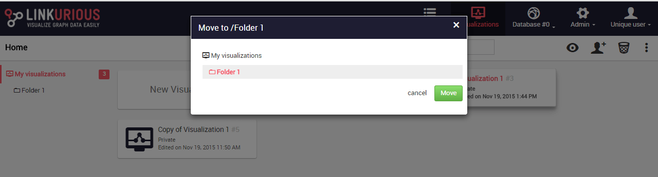
We select the folder we want to move to our visualization:
The visualization has been moved to the folder.
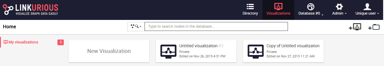
It is possible to duplicate a visualization. This feature might be useful when we want to try new things in our visualization and keep a record of the last version, this way the duplicate is used as a draft.
It is possible to duplicate a saved visualization from the Dashboard as follows:
We then click on Duplicate and a copy of our visualization is
displayed and directly accessible on the Dashboard:
It is also possible to duplicate a saved visualization from the Workspace via the "Save as" function in the Menu:
The duplicate is then accessible from the Dashboard menu.
Note that after duplicating from the Workspace, the document we are then working on is the duplicate.
It is possible to duplicate a visualization shared with you by another user.
If a user has shared a visualization with you but you are not allowed to modify it, duplicate this visualization. You will be able to modify the copy.
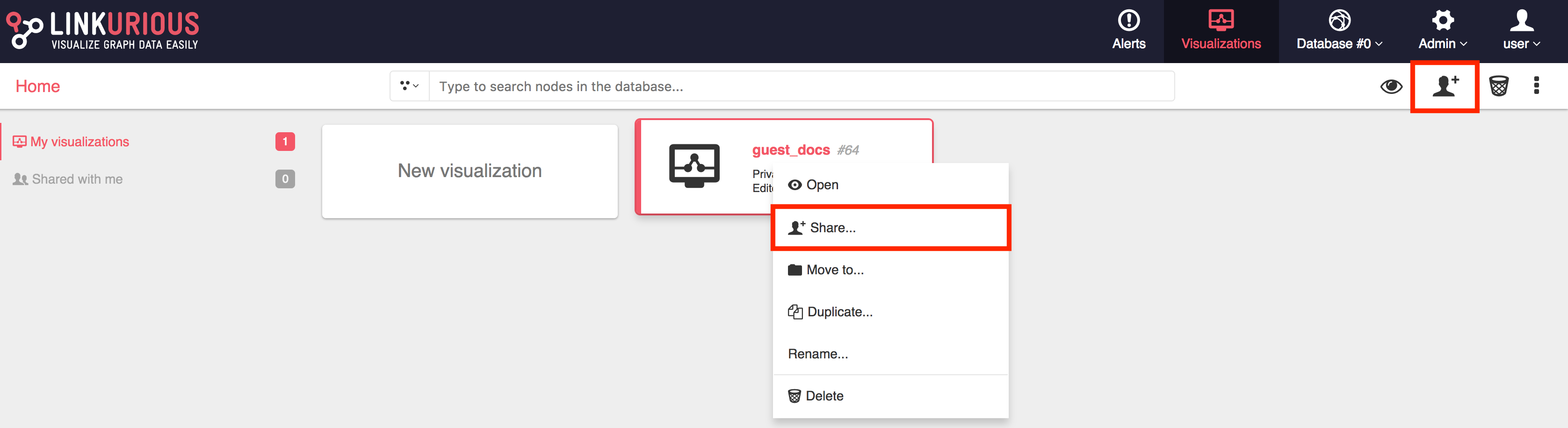
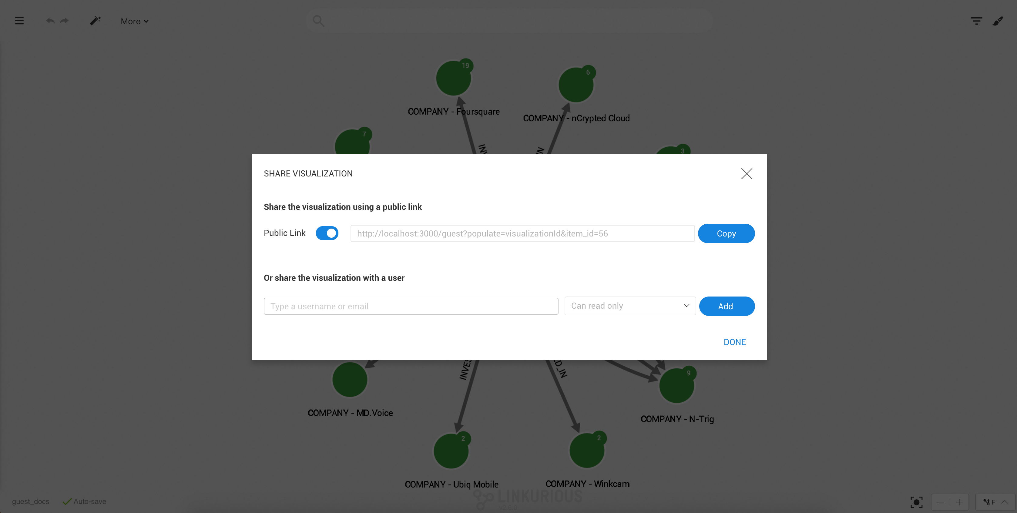
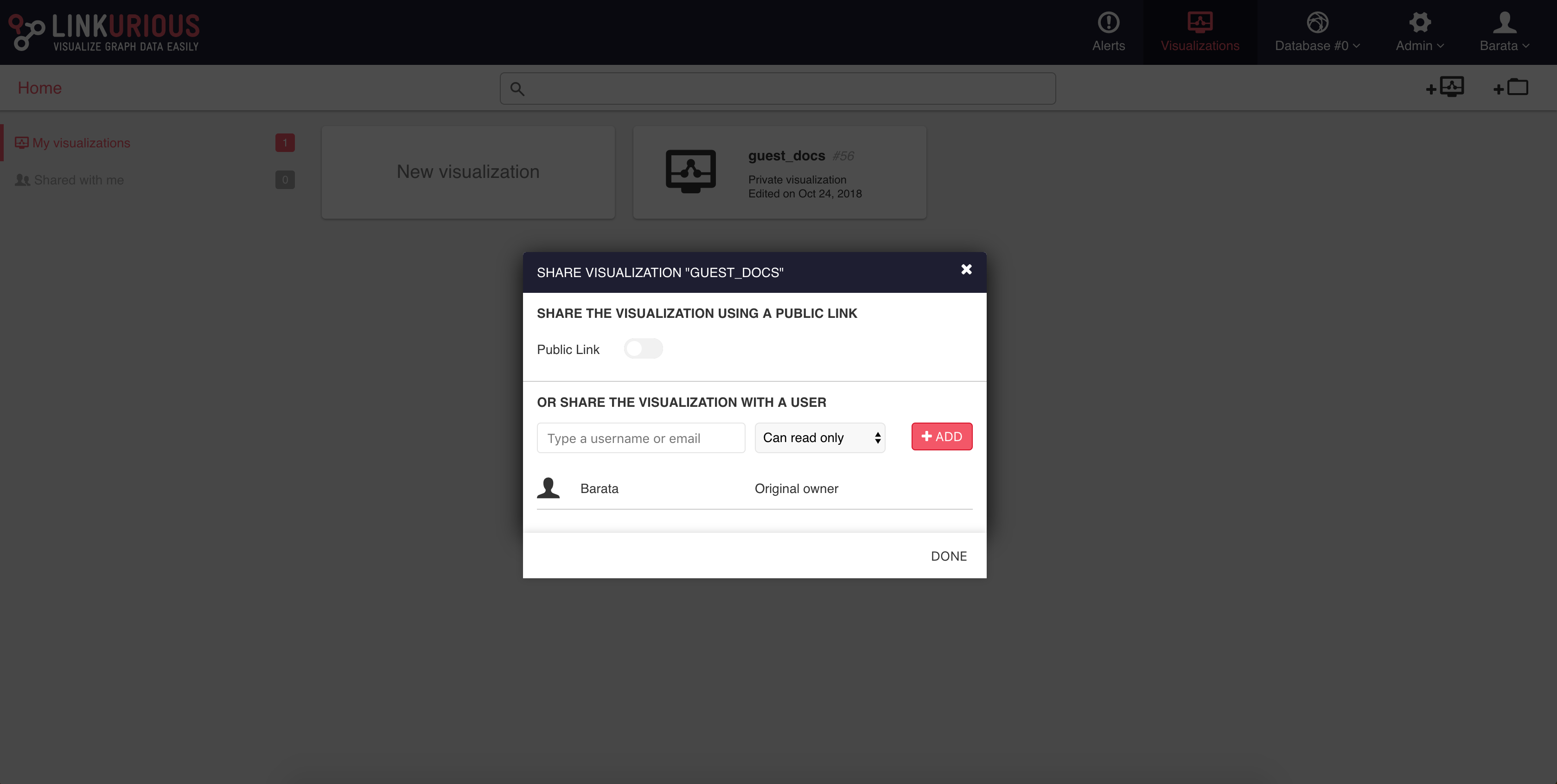
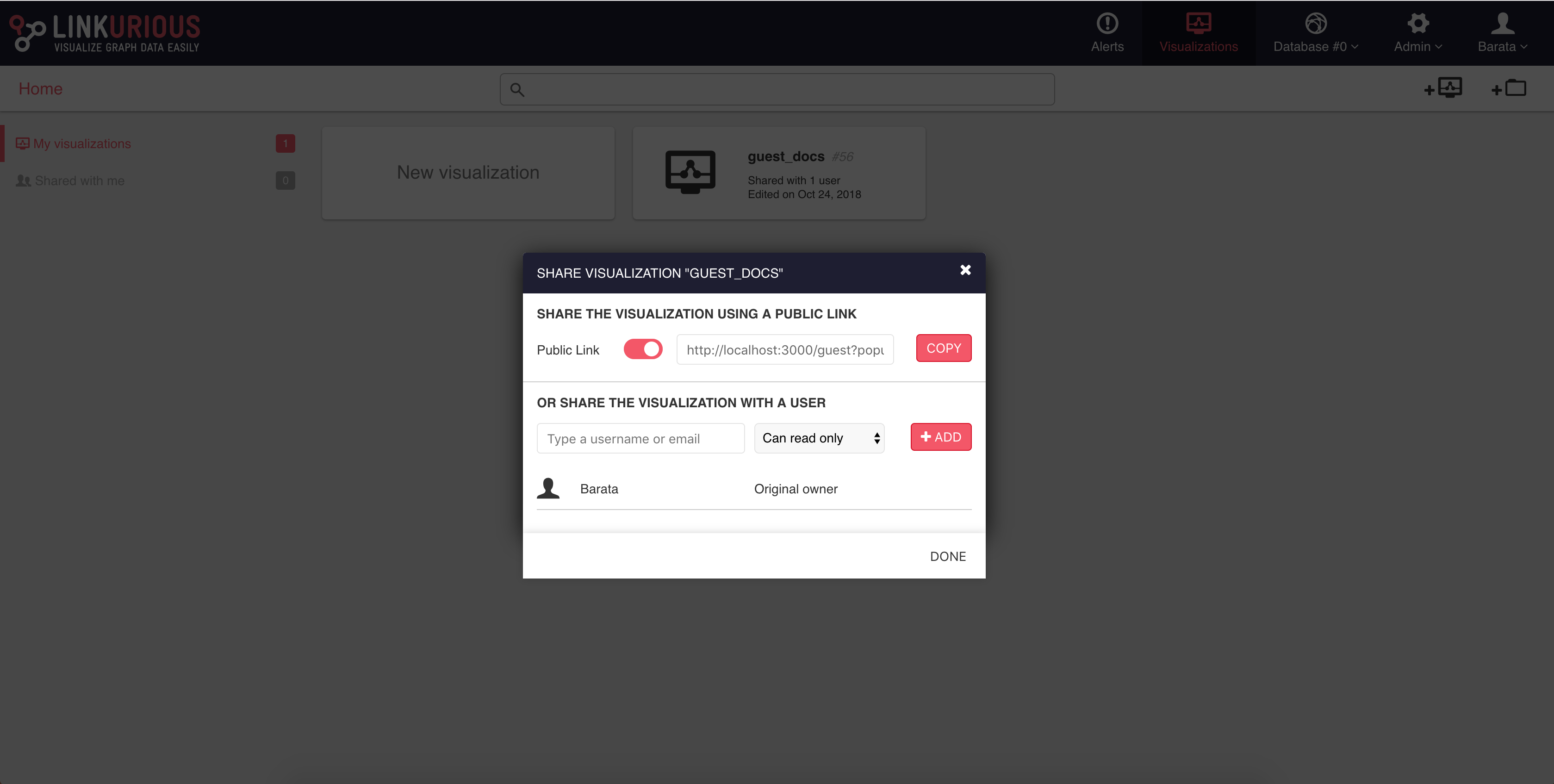
It is possible to share a visualization with another Linkurious Enterprise user. People we share a visualization with will be able to access it through the interface. If we right-click on a visualization, we can share it as follows:
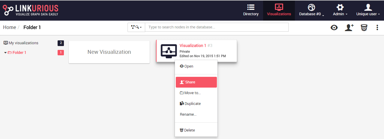
We click on the Share menu and type the username or email of the
person we want to share the visualization with.
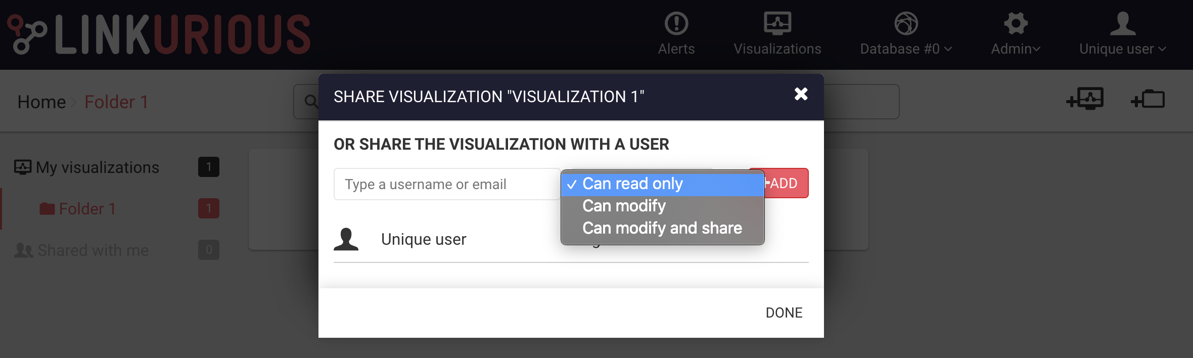
We can give read-only rights, allow modifications or allow both modifications and sharing.
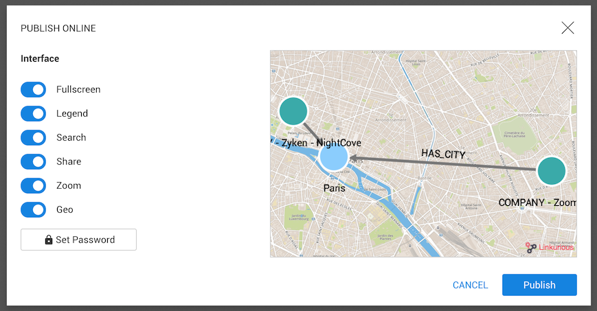
Linkurious Enterprise offers the possibility to publish interactive visualizations online. Published visualizations can be accessed with an URL or embedded in a Web page à la Google Maps. They contain a snapshot of graph data at the time the visualization is published. The visualization author can update or un-publish his visualizations anytime. Anyone can explore these visualizations interactively, enabling easier collaboration around graph data.
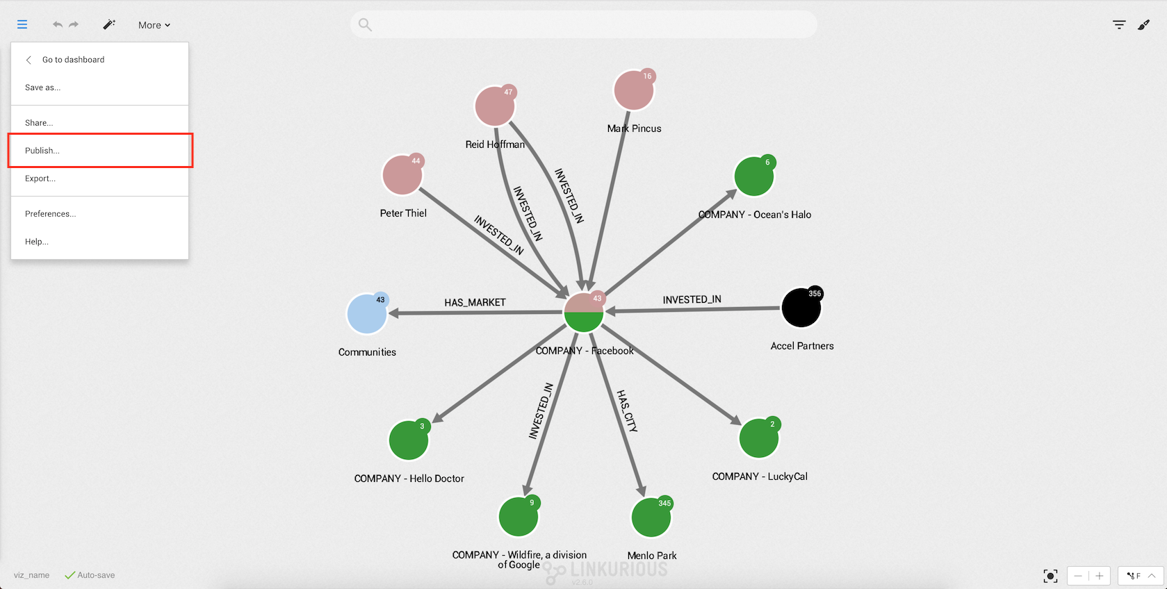
We can publish a visualization from the Workspace via the left menu:
Before publishing a visualization, we can choose various options to customize the interface:
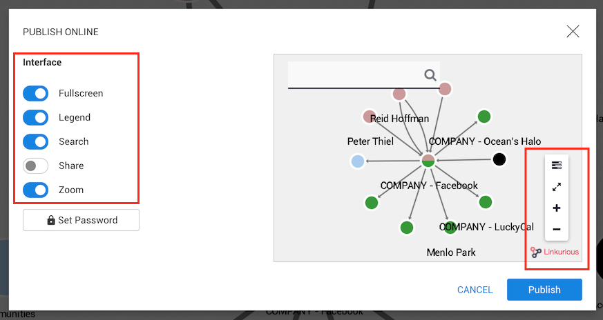
The options are:
In the screenshot above, we have disabled the share option.
We can see that the Share button on the right of the screen
disappeared.
Finally, we can publish it:
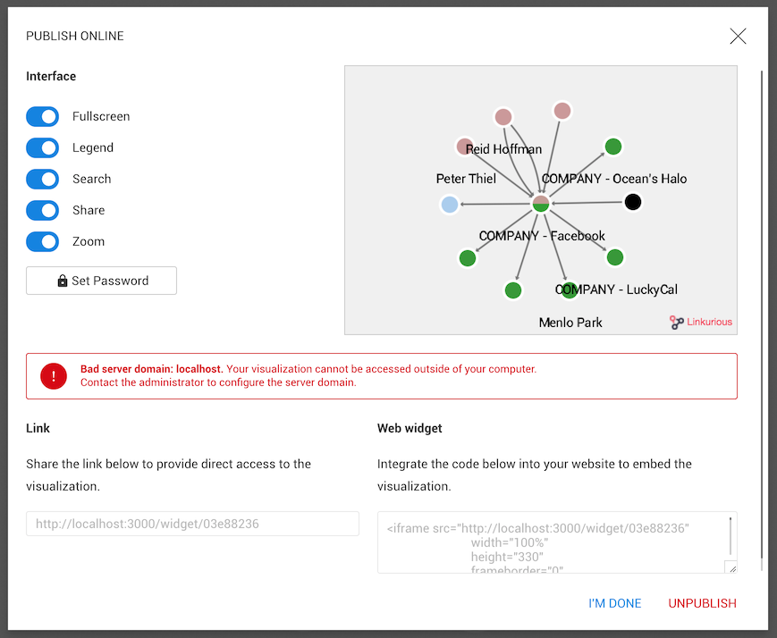
The visualization is now available online! We can share the link or integrate it into a web page by adding the script of the web widget into the source code of a web page.
If the server that hosts Linkurious Enterprise is accessible via intranet only, published visualizations will be available within the organization and won’t be available outside.
We have created a visualization and we want to share or modify its
content.
We open the Workspace menu, then click on the Export button.
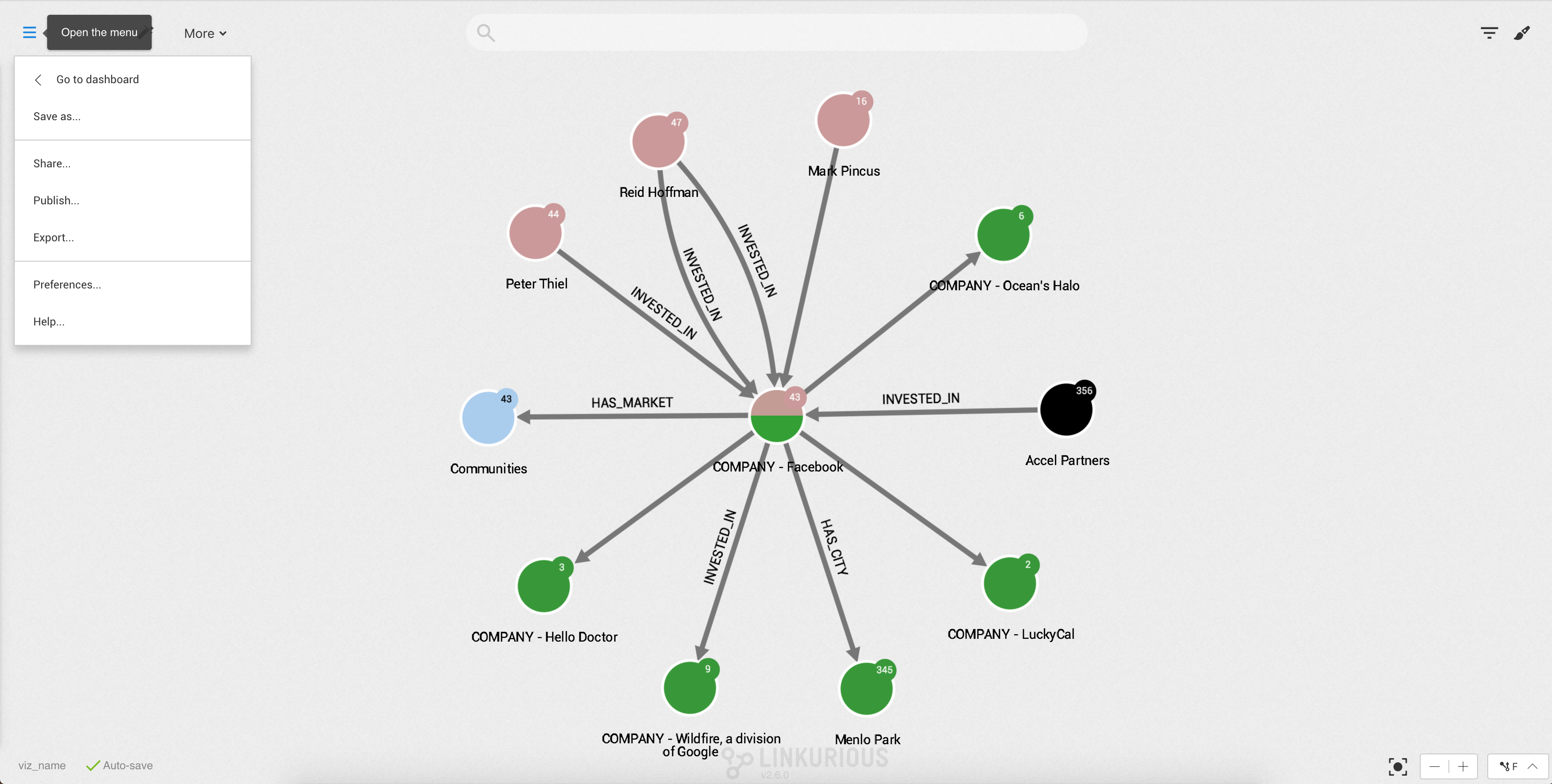
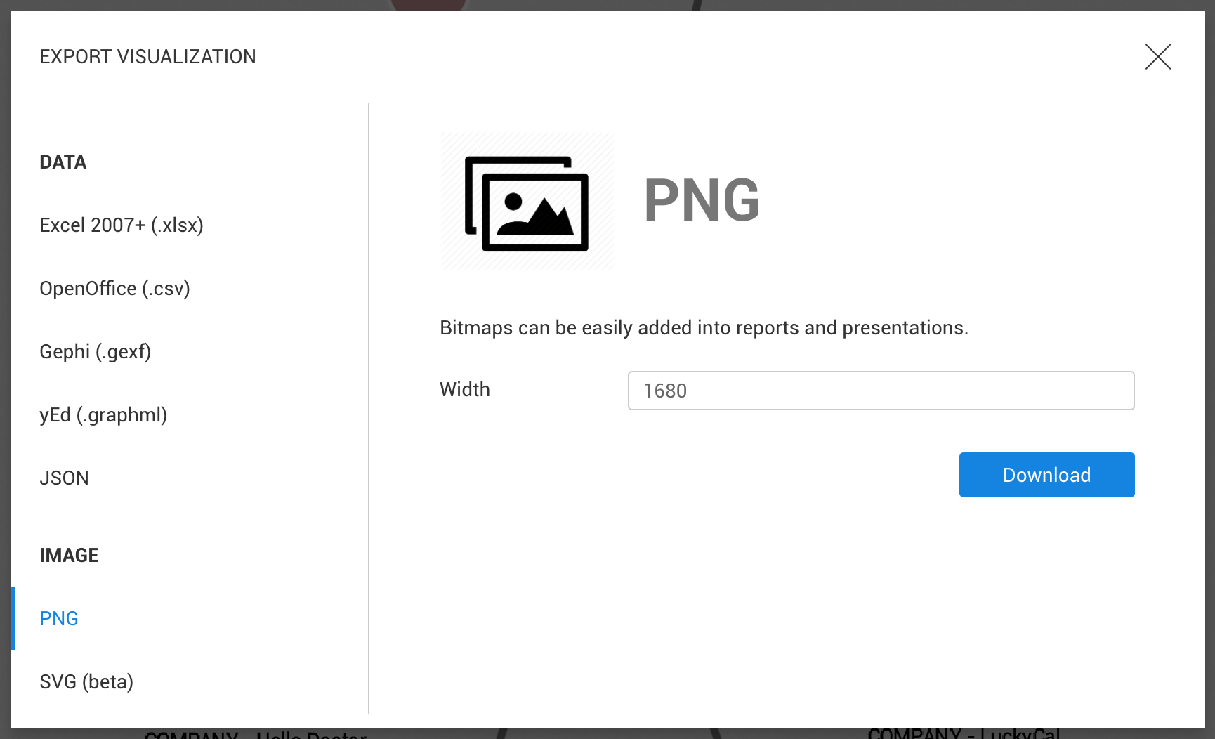
The visualization data can be exported in the following formats:
After clicking on a format, we can configure the export (PNG and SVG) and click on Download.
The file is automatically downloaded by the browser.
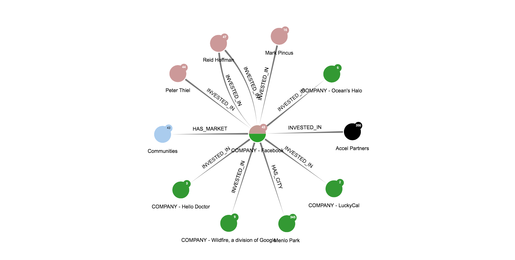
The PNG export available here will create an image of the complete graph even if we are currently zooming to a specific area. Here is an example:
This feature is different from the Screenshot button available on match and guest visualizations: it creates an image of the displayed area on the screen only.
Deleting a visualization is only possible through the Dashboard
Either:
Delete
button of the toolbar.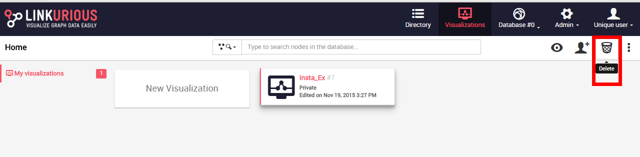
Delete button.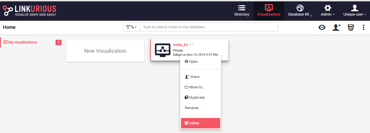
The visualization is deleted after confirmation.
In this chapter, we will learn how to use alerts to investigate cases. Any user with the right to manage alerts can configure an alert via the Alert edition panel. Users will then get a list of cases for each alert.
In use cases such as fraud investigation and IT monitoring, alert cases are detected when there is an anomalous pattern in the data. A team of analysts will investigate the cases to confirm them or dismiss the false positives. Graph visualization facilitates data exploration and the collection of visual evidence of suspicious activities. The analysts can then escalate the case by reporting and sharing the visualization.
The challenge, however, lies on the quantity of cases to process within a limited amount of time. A score can be defined for an alert such as potential money lost, risk score, or date of detecting the case.
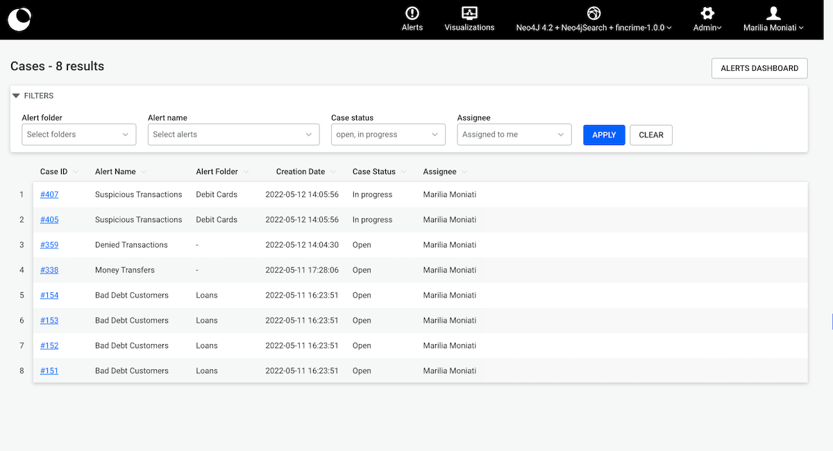
The unified case list is where all the cases a user has access to can be displayed. It is accessible to all the users who can access and/or create alerts. The list of cases displayed can be adjusted using filters.
A "by default" filter is applied every time a user accesses the page, which shows the cases which have status Open or In progress and are assigned to the currently logged in user. This enables users to focus on the evolving cases which they are responsible for.
The unified case list is always sorted in descending order, meaning the newest case is always displayed first. Sorting can be modified according to the needs of the user by sorting the remaining columns of the unified case list. To go back to the initially sorted view, sort by the "created at" column in a descending order.
Users can navigate to the 'Alerts Dashboard', where they can also create alerts, when clicking on the 'Alerts Dashboard' button.
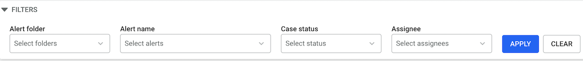
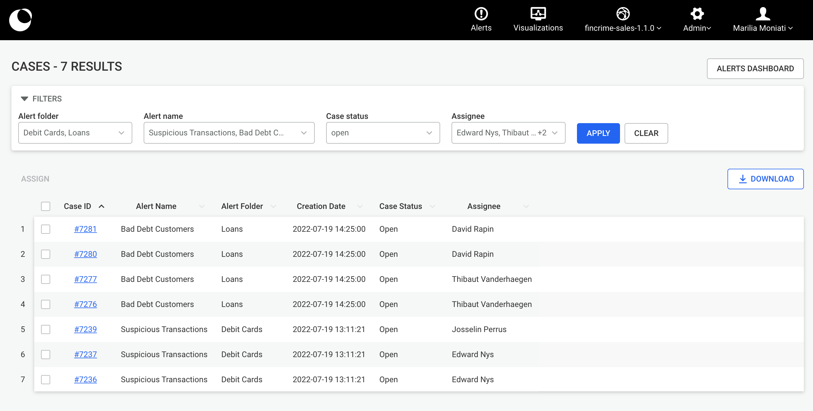
Different combinations of filters can be applied. Users can filter by one or many Alert folders, Alert names, Case statuses and Assignees. When filters are cleared, by clicking on the clear button, all the cases a user has access to are displayed.
Filters and sorting are persisted to help users not lose the context of their work when navigating in the app.
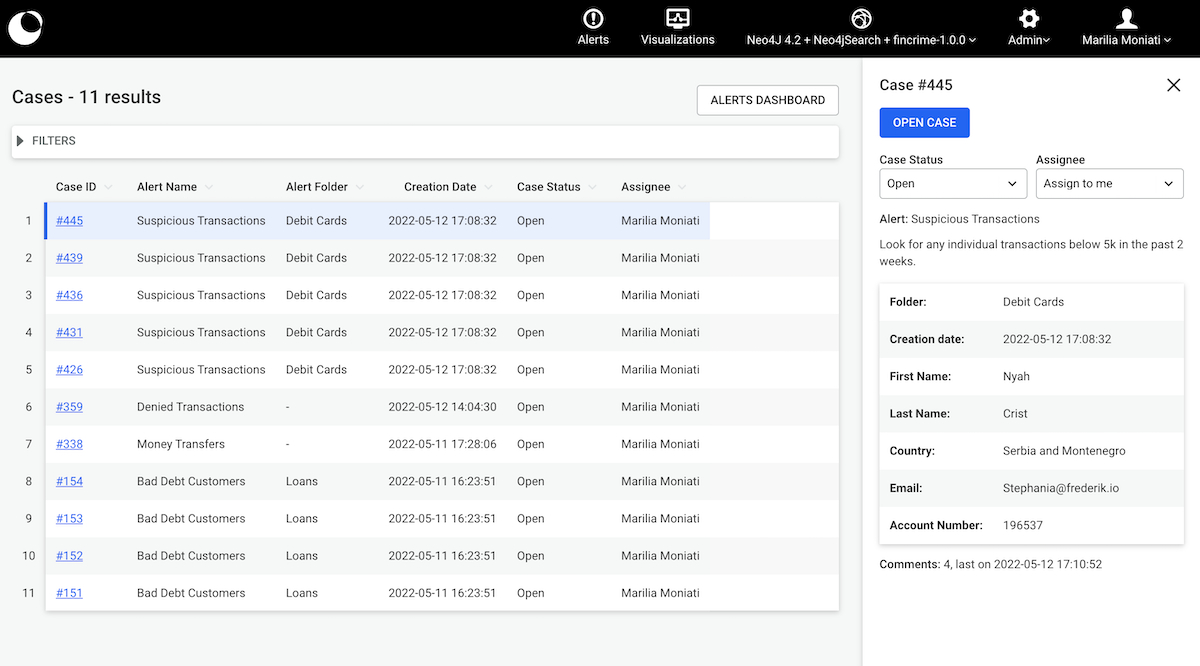
The case preview can be accessed by clicking on the case's ID. From the case preview the case view can be opened. Moreover, details on the information the case holds such as alert name, alert description, case attributes and number of comments as well as the timestamp of the latest comment are shown. Furthermore, users can change the status and assignee of a case, exactly in the same manner they do on the case view, from the case preview.
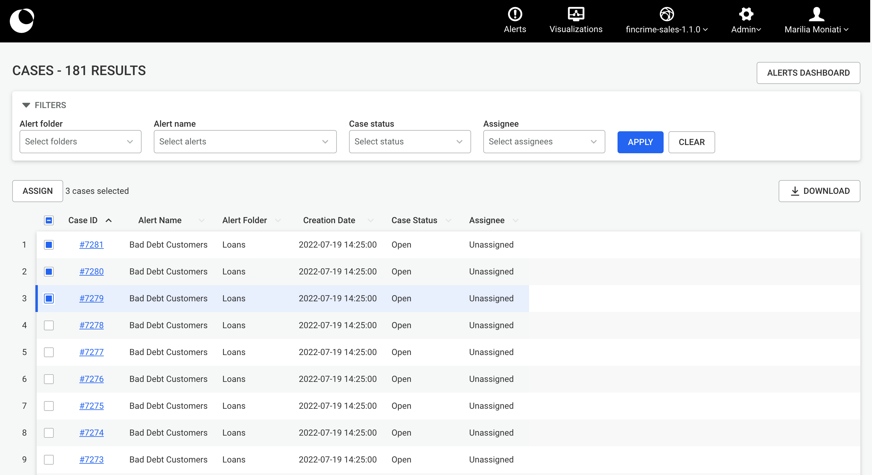
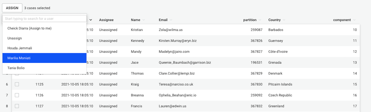
Users can assign one or multiple cases to another user or themselves in one go, from one or many alerts at a time. This is particularly useful for a team leader dispatching the workload among their team, especially in combination with the usage of filters.
To use this feature, the user needs to select one or many cases from the unified case list (clicking on checkboxes). The “ASSIGN” button will activate upon the first selection. Users can pick cases from the different pages of the list. The number of cases selected will show next to the “ASSIGN” button.
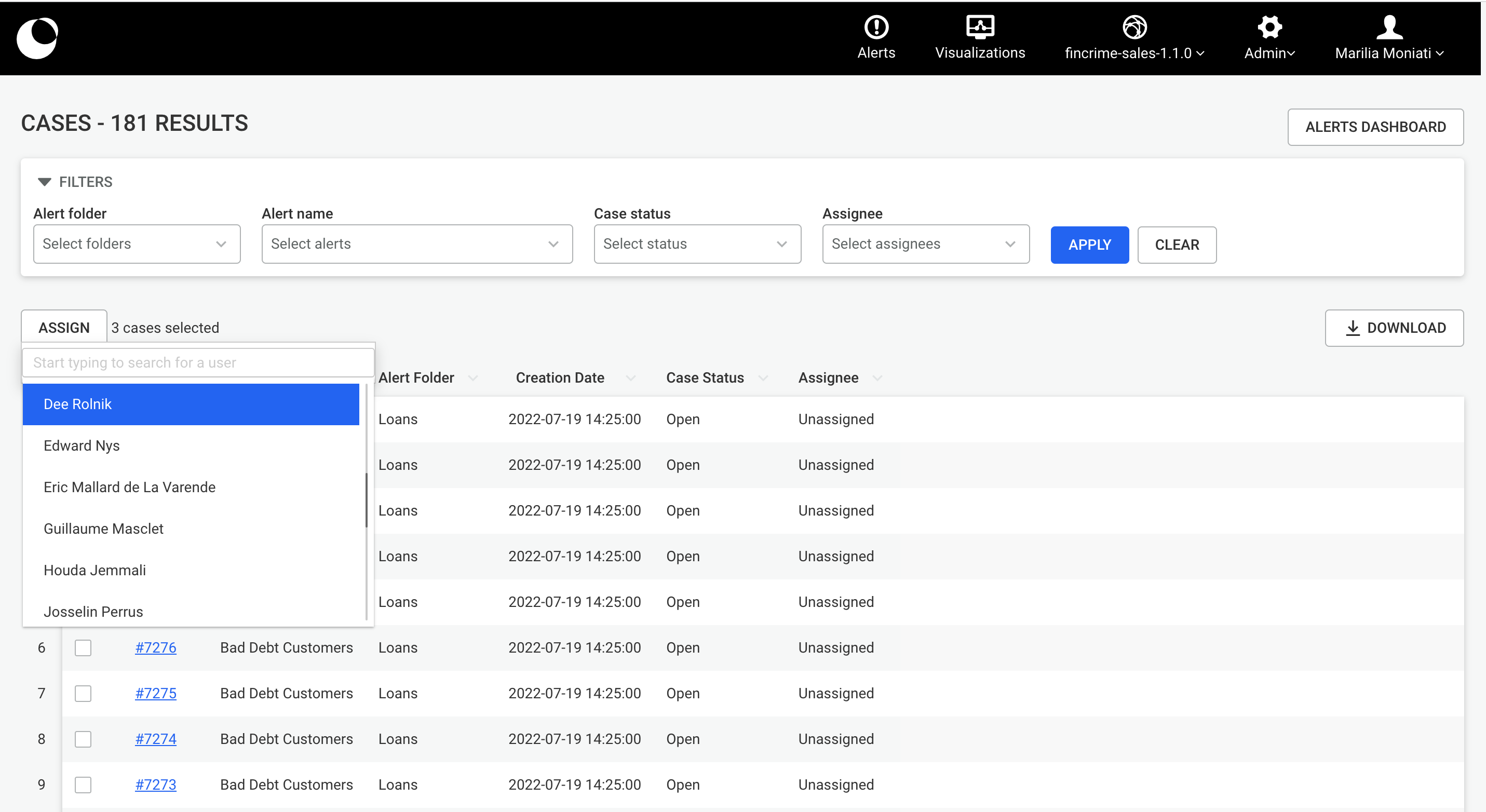
Once the user is done selecting cases, they will pick a user name from the dropdown list that opens upon clicking on the “ASSIGN” button. Only the users who have access to all the alerts to which the selected cases belong, will show on the list. If a user is lacking access to at least one of the cases’ alert, they won’t be displayed. Also, if new filters are applied or if filters are cleared, the current selection of cases is unselected.
From the unified case list, users can download an excel file containing all the cases which the applied filter returns. This file contains information which will enable analysts to monitor the team's activity and share it with fellow colleagues. and answer possible questions a they may have, such as:
The file begins to download once the button is pressed. In the downloaded file, for each case, you will find its id, creation datetime, status, assignee username, assignee email, assigned datetime, dismissed or confirmed datetime, the alert name and folder name the case belongs to as well as the export datetime.
In case the applied filter returns more than 500k cases, download would not be possible.
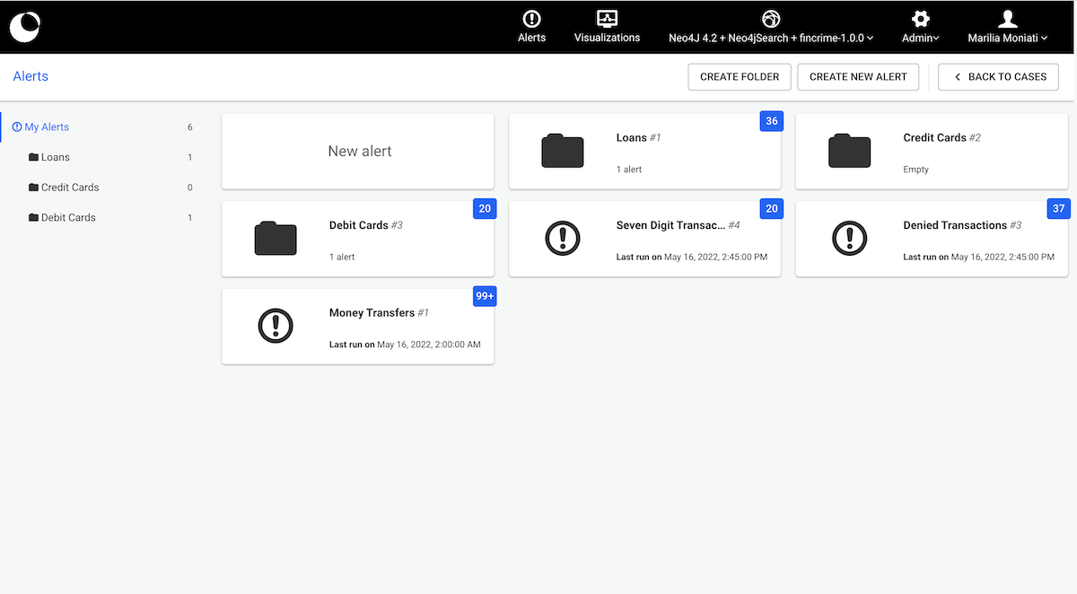
The Alerts Dashboard displays the alerts available to users.
It is always accessible to those who have the right to “Create & Process Alerts” (see Access Rights). However, users who have the right to “Process Alerts” can only access the dashboard if at least one alert exists.
From the Alerts Dashboard, we can:
When at least one folder exists, the file tree is displayed on the left.
The blue badge displayed above alerts and folders is there to inform users on cases requiring attention (cases with the status: open and assignee: unassigned).
Users clicking on 'Back to Cases' are navigated to the Unified case list.
The "Case List" shows a list of newly detected cases for each alert. Each row in the list is a case.
By default, cases are ordered by creation date.
You can change sorting order by using custom columns, if the alert creator has defined any.
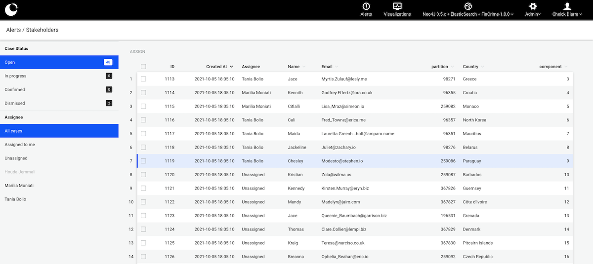
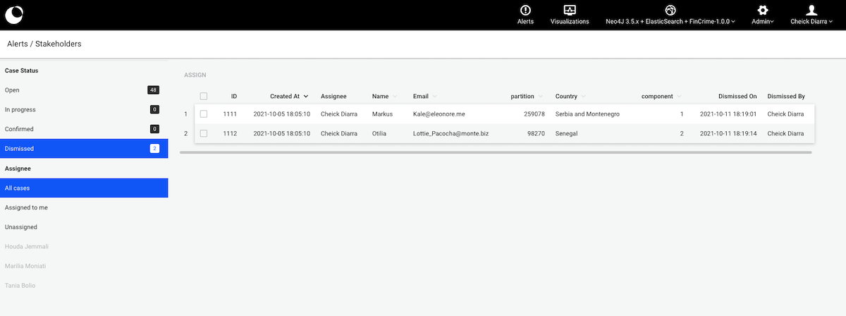
A case has a status that is either Open, In progress, Confirmed, or Dismissed.
New cases have the Open status by default.
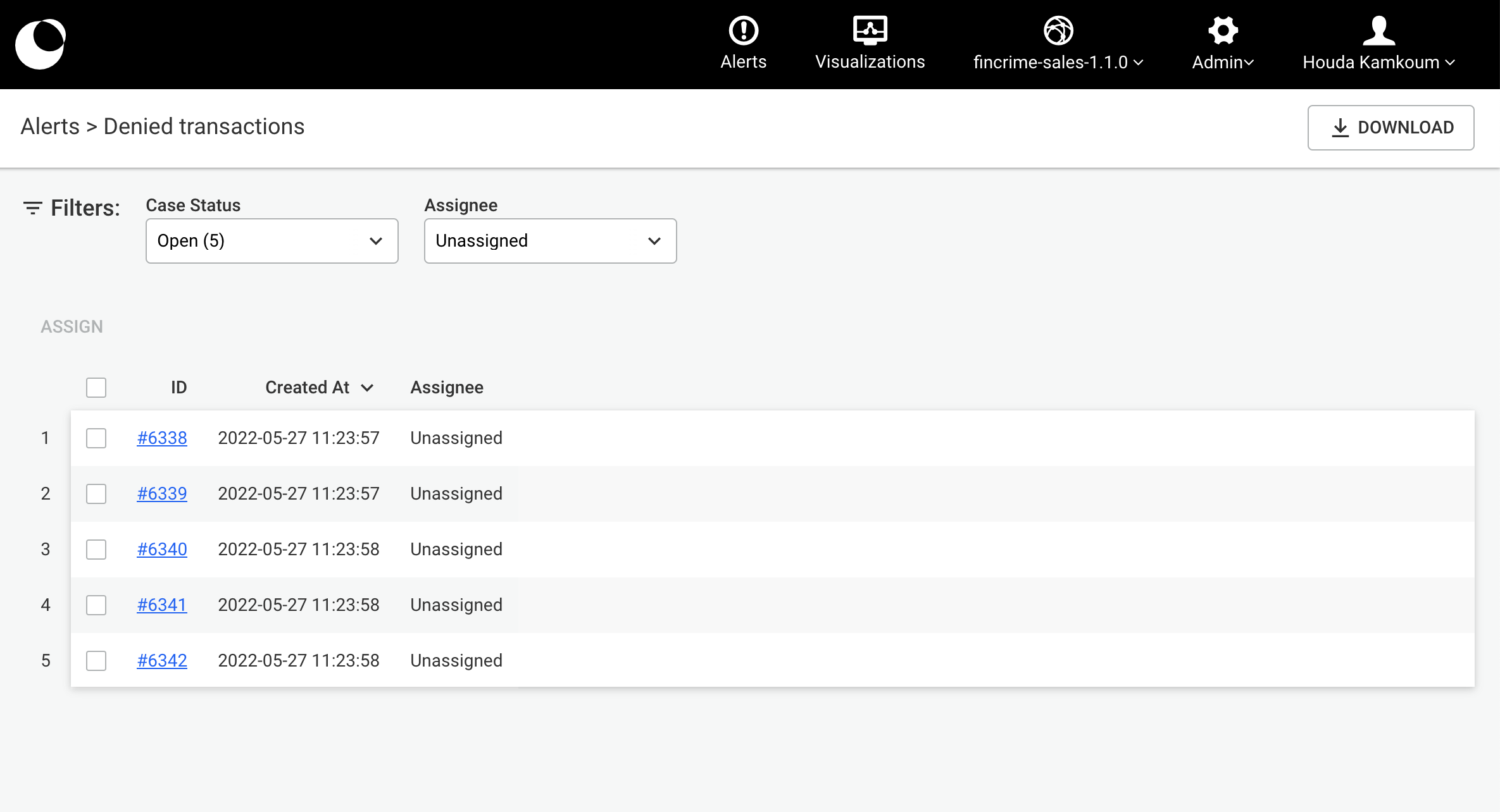
The list of cases can be filtered by status.
For example, the image below shows the list of dismissed cases.
We can also see who has changed the status of those cases.
You can also filter the list of cases by assignee. In the example below, we can see all the cases opened and assigned to the current user.
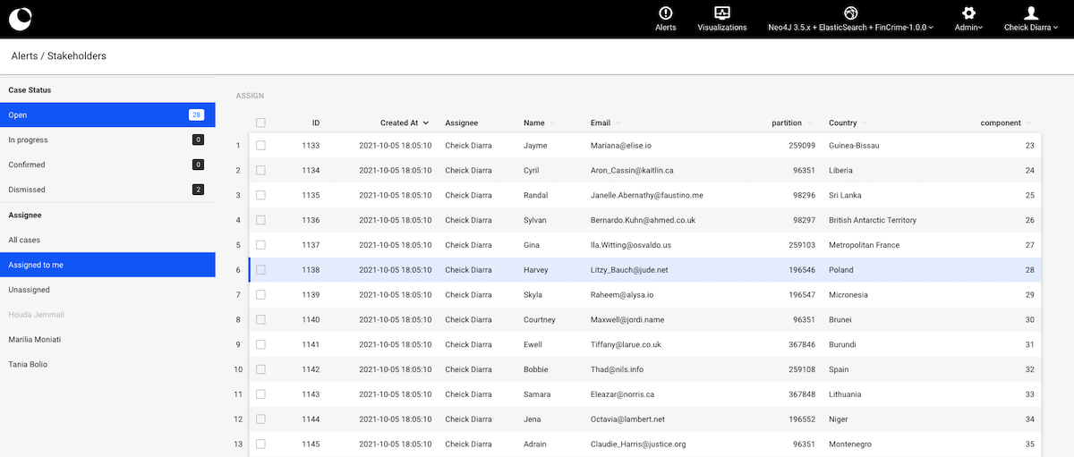
If a user has no cases assigned to him, his name will appear greyed out in the list.
Within the list of cases, you can assign them to users that have the right to process the alert.
To do so, you can select cases from multiple pages by checking the checkbox on the left of every row.
You can also select all the cases within a page by clicking on the checkbox on top of the list of cases.
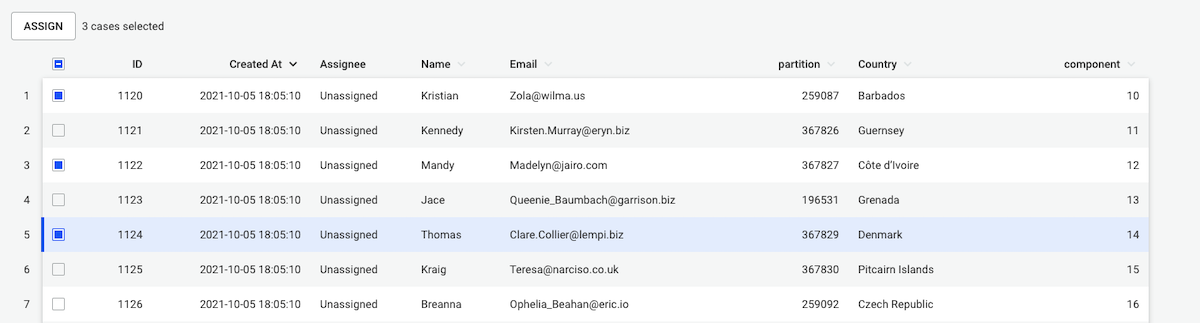
Once cases are selected, you can assign them to a single user by clicking on the button "Assign".
To take a decision, you must investigate on a case. Simply click on the ID of a case to open the case view.
From each alert's case list view, users can download an excel file containing all the cases of the alert. This file contains information which will enable analysts to monitor the team's activity, share it with fellow colleagues and answer possible questions a they may have, such as:
The file begins to download once the button is pressed. In the downloaded file, for each case, you will find its id, creation datetime, status, assignee username, assignee email, assigned datetime, dismissed or confirmed datetime, the alert name and folder name the case belongs to and the columns as well as the export datetime.
You can investigate a case by clicking on it in the case list. It opens a dedicated interface where you can:
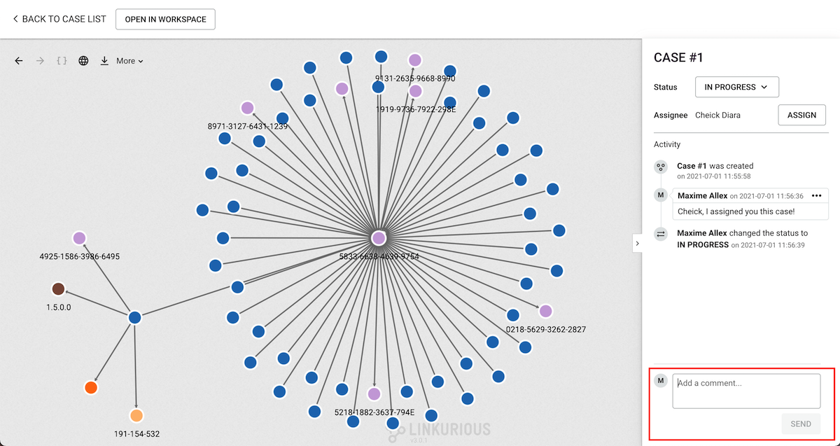
Some features such as expanding nodes, hiding items, filtering and grouping are available to help in the investigation. Clicking on a node or edge opens the property panel that displays its type and properties. You can also download an image of the case, use the geo mode, and undo or redo the last action.
You can save the current state of the investigation by clicking on the "Save" button that
appears after you update the visualization (e.g. by adding a node).
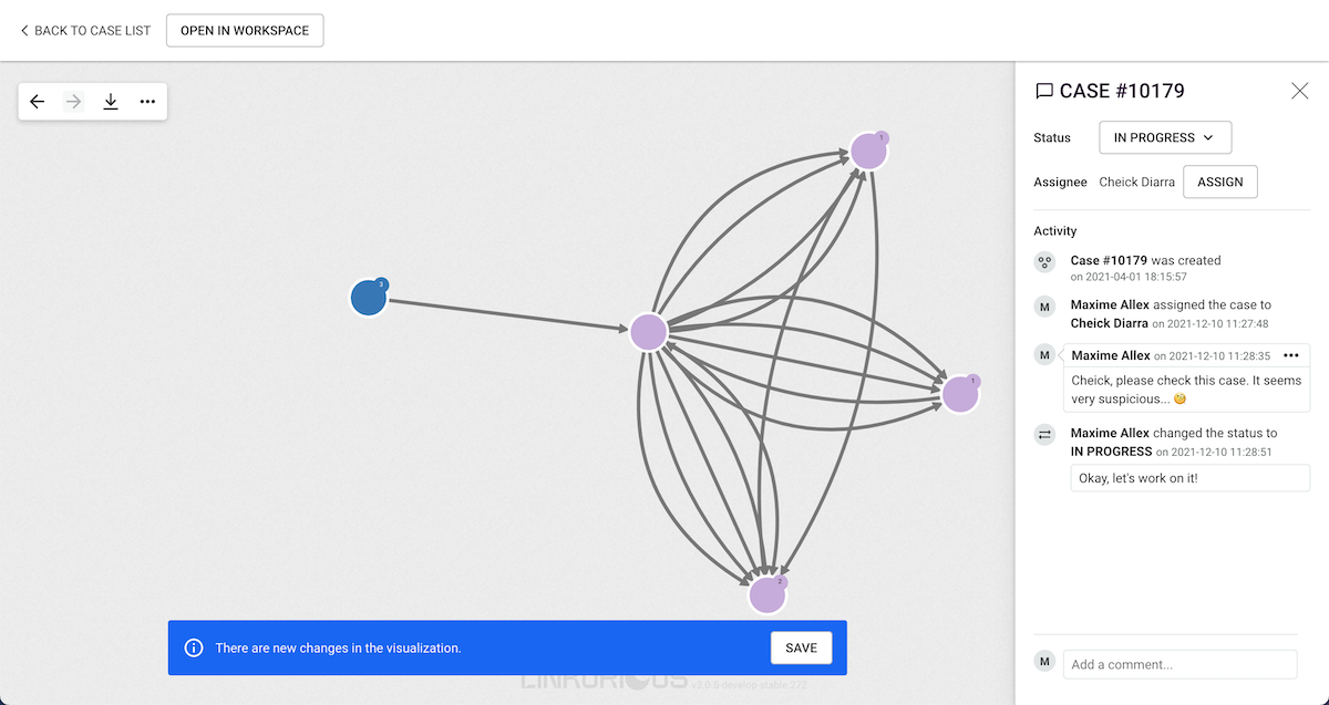
You can add comments on a case and share more information with collaborators.
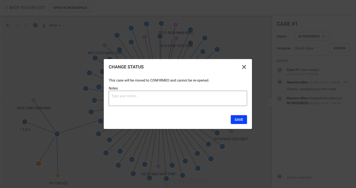
You can change the status of the case (from the top-right of the page).
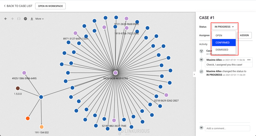
When changing the status to either In progress, Confirmed or Dismissed, you will be prompted for an
optional note, to document the decision for future reference.
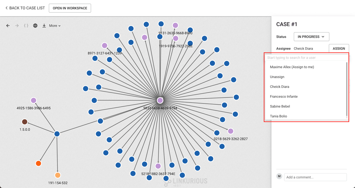
You can assign the case to someone directly through the information panel. To do so, you just need to click on "Assign" button next to the assignee username. You will find the history of assignement in the activity panel, with comments and status changes.
The Guest mode is a way to share graphs with people who do not have an account on Linkurious Enterprise.
Key characteristics:
The Guest mode is available once an Administrator has enabled it.
Standard user interface:
Guest mode user interface:
There are 2 options to share a visualization with the Guest mode: